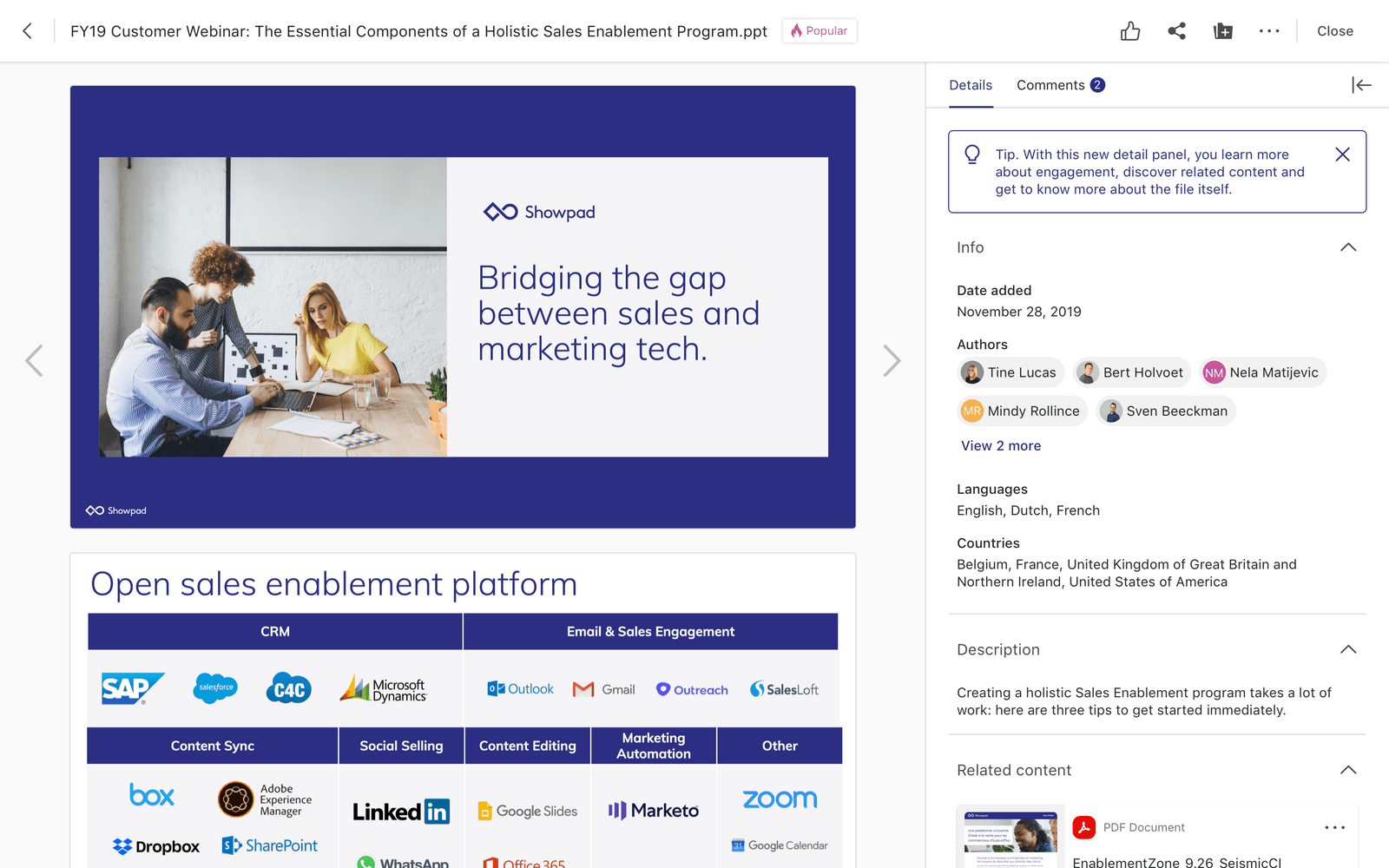
Showpad
shipped
Coach Integration
role
Lead Product Designer
Timeline
JAN 2025 - JUN 2026
Responsibilities
0 to 1 design ∙ user research ∙ design system
01: Business Case
Context
When LearnCore was acquired in 2018, there was a 9 month rush to "integrate" the products. Because of this timeline, there were many gaps and inconsistencies in UX, systems, and interactions between the LMS product and the rest of the Showpad platform, leading to frustration and a steep learning curve for users.
Goals
1. Create consistency in overall visual design
2. Align product concepts and architecture
3. Make sure UX and behavior patterns are cohesive
4. Reduce Coach and platform customer complaints
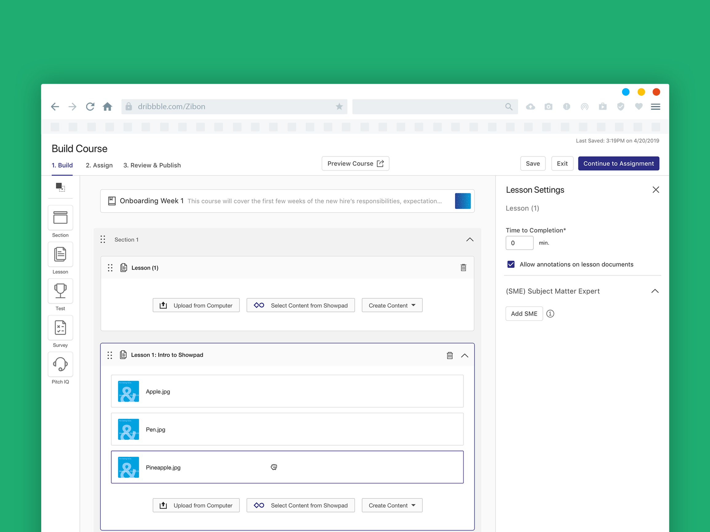
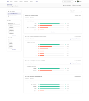
02: the Current State
User Interviews
Initial research interviews were done to understand the pain points users experience with the current implementation of all 4 products. Simultaneously we were also getting tickets from customers reporting some of these issues themselves. With this feedback we used it as a basis to validate a need for change & alignment while also considering for some specific use cases that the "content" product has not accounted for.
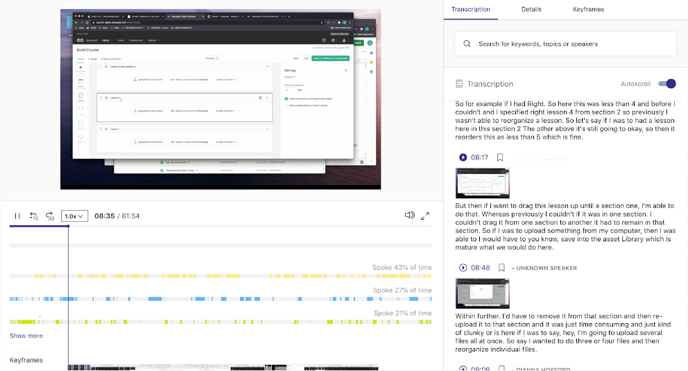
Screenshot of Showpad Meeting IQ transcription of user interviews.
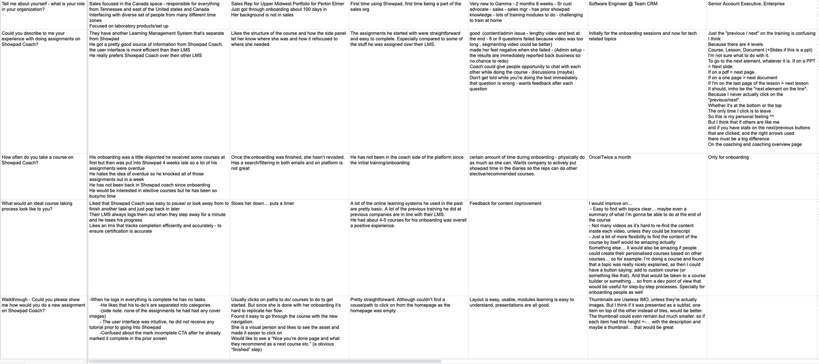
Spreadsheet of user answers to interview questions.
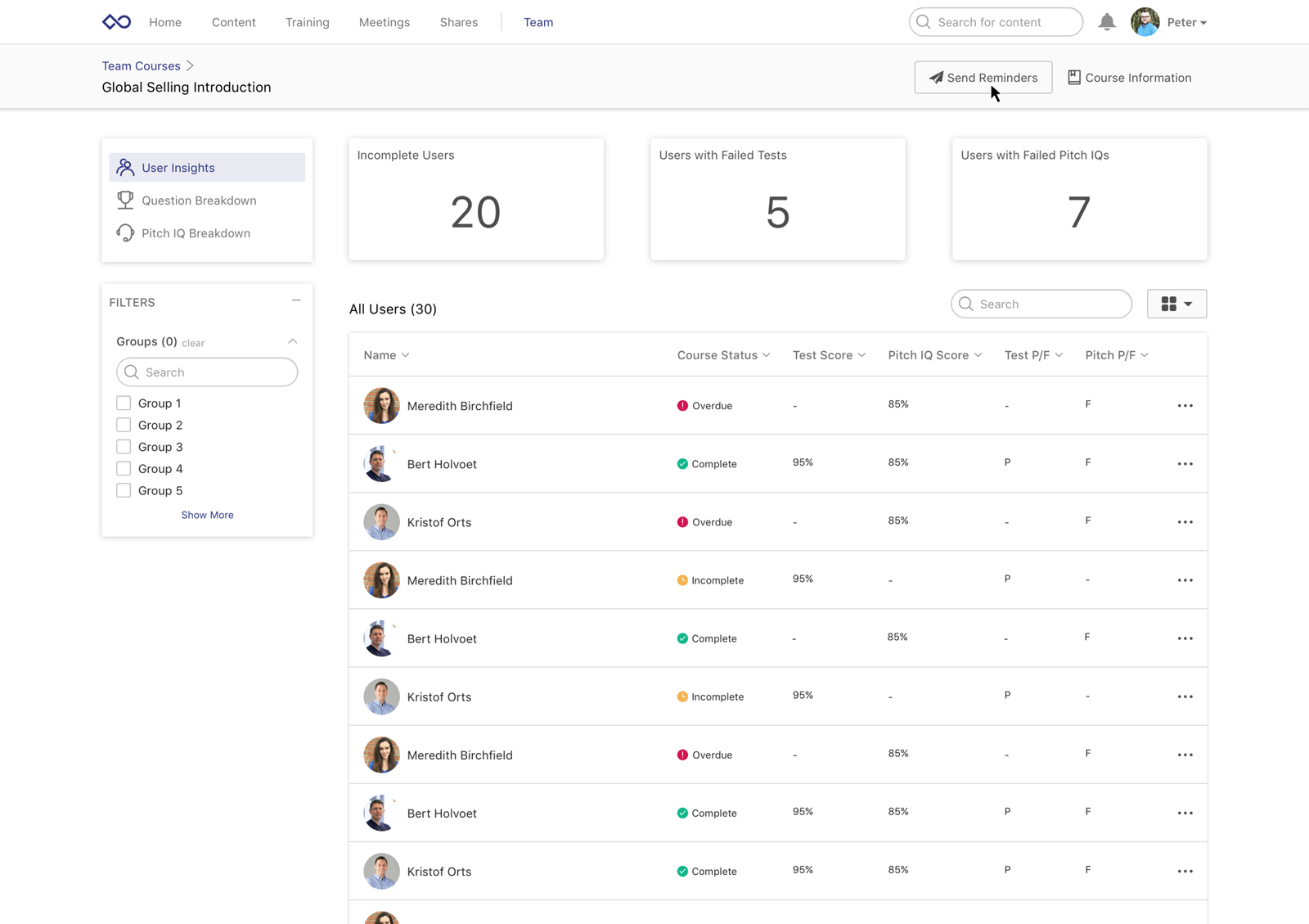
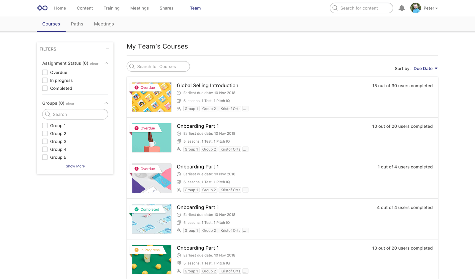
03: IdentifIED Gaps
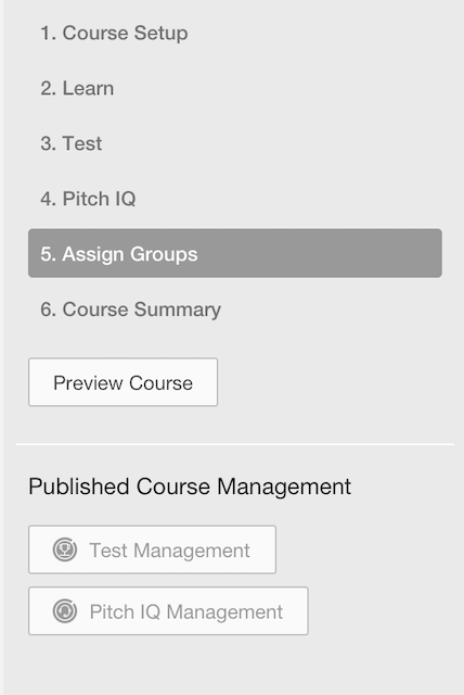
What is Coach?
Showpad "Coach" product is a sales team learning management system that consists of 4 major facets. Each facet, has a primary user persona.
- Creation
Admin
- Ineffecient flow; steps are linear and require saving after each single one.
- Users want to a tool to build/draft them faster.
Coach
Content
The creation of course and training materials done by the admin persona.
The creation of course and training materials done by the admin persona.
- Storage
Admin
- UI is very confusing and doesn't not aid with findability.
- Cross platform users are used to the content library UX and have to shift mindsets/learn a new pattern to use coach library.
Coach
Content
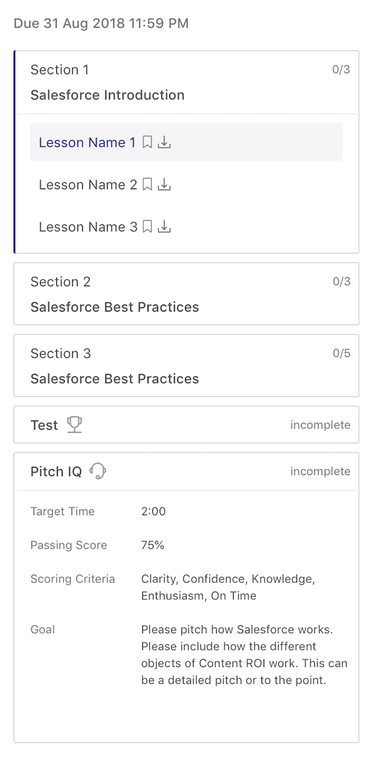
- Consumption
Sales Rep
- Users often miss the previous and next arrows in the header to navigate through learning content and use the sidebar instead.
- They believe they are complete but the UI is not which is confusing.
- Our customer's course creators actually ended up custom designing the first page to instructing users to use the top arrows... 😬
Coach
Content
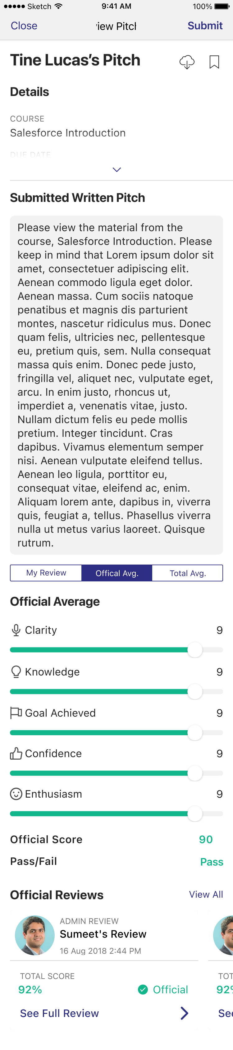
- Insights
Sales Manager
- Managers wanted more user centric insights.
- The current insights spoke more towards the admin persona.
- The UI seemed "dirty" due to the overuse of shadows.
Coach (Only)
04: Unifying Patterns
Identifying Parallels
Parallels were drawn to identify opportunities for alignment. Any similar concept was should exist in the same place and behave the same way.
Coach
Content
Containers
A course holds media but also tests & PitchIQs
A page holds media, text, etc components
Components
Course components can be a section, lesson, test, survey, PitchIQ
Coach
Content

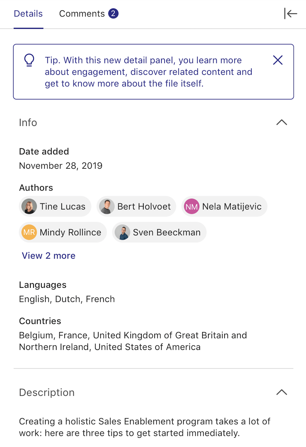
Information
Course info has no naming / title
“Details” tab next to comments.
Comments
"Discussion" button in header
“Comments” tab in side panel next to details
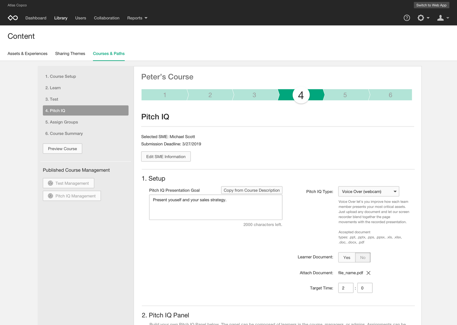
05: Design Refinement and Beta Testing
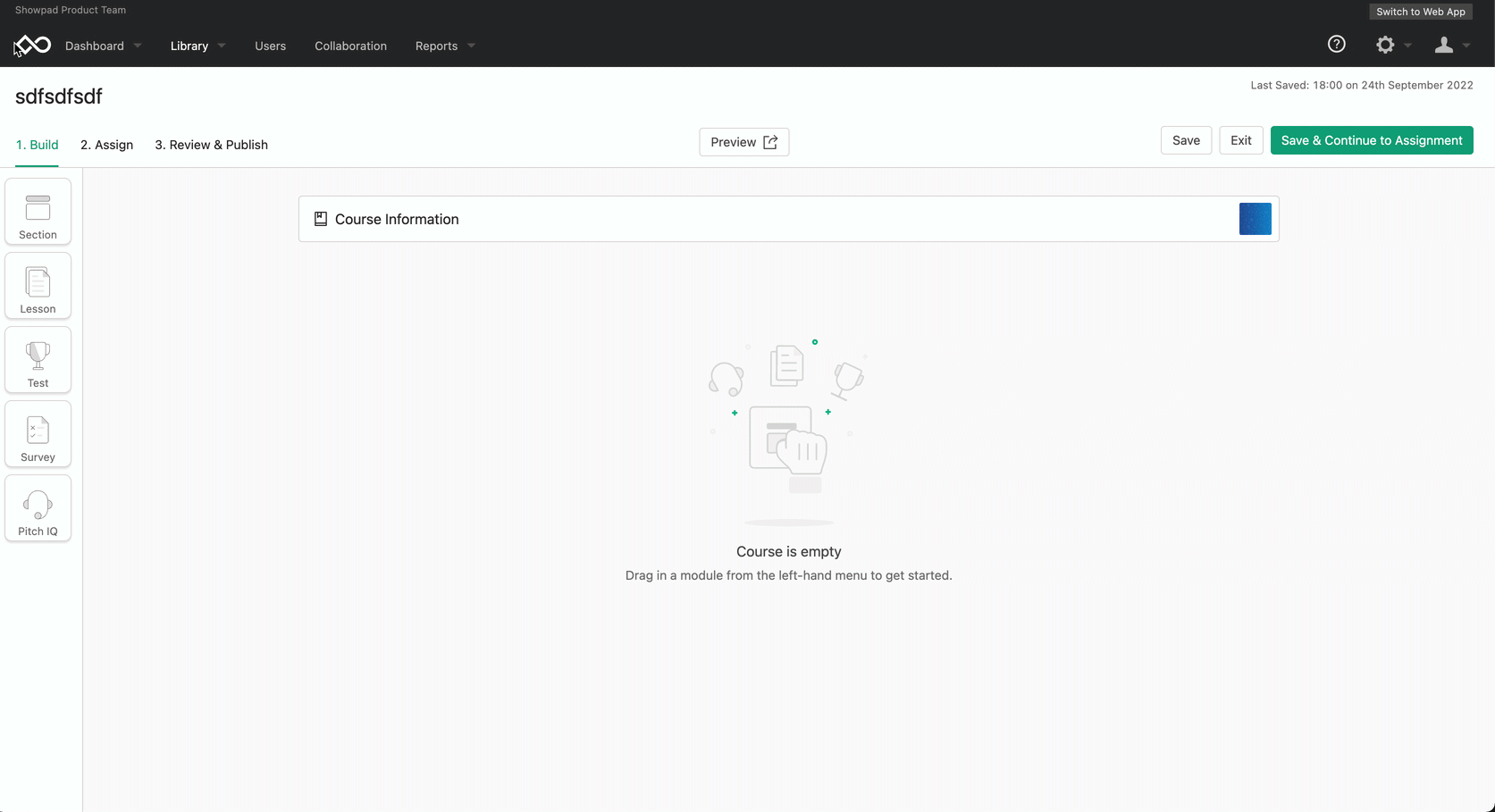
Design Refinement
With all the feedback and defining done, I took those into account when mocking up extensive flows, covering edge cases and being as detailed as conveying to developers how certain features should behave and animate.
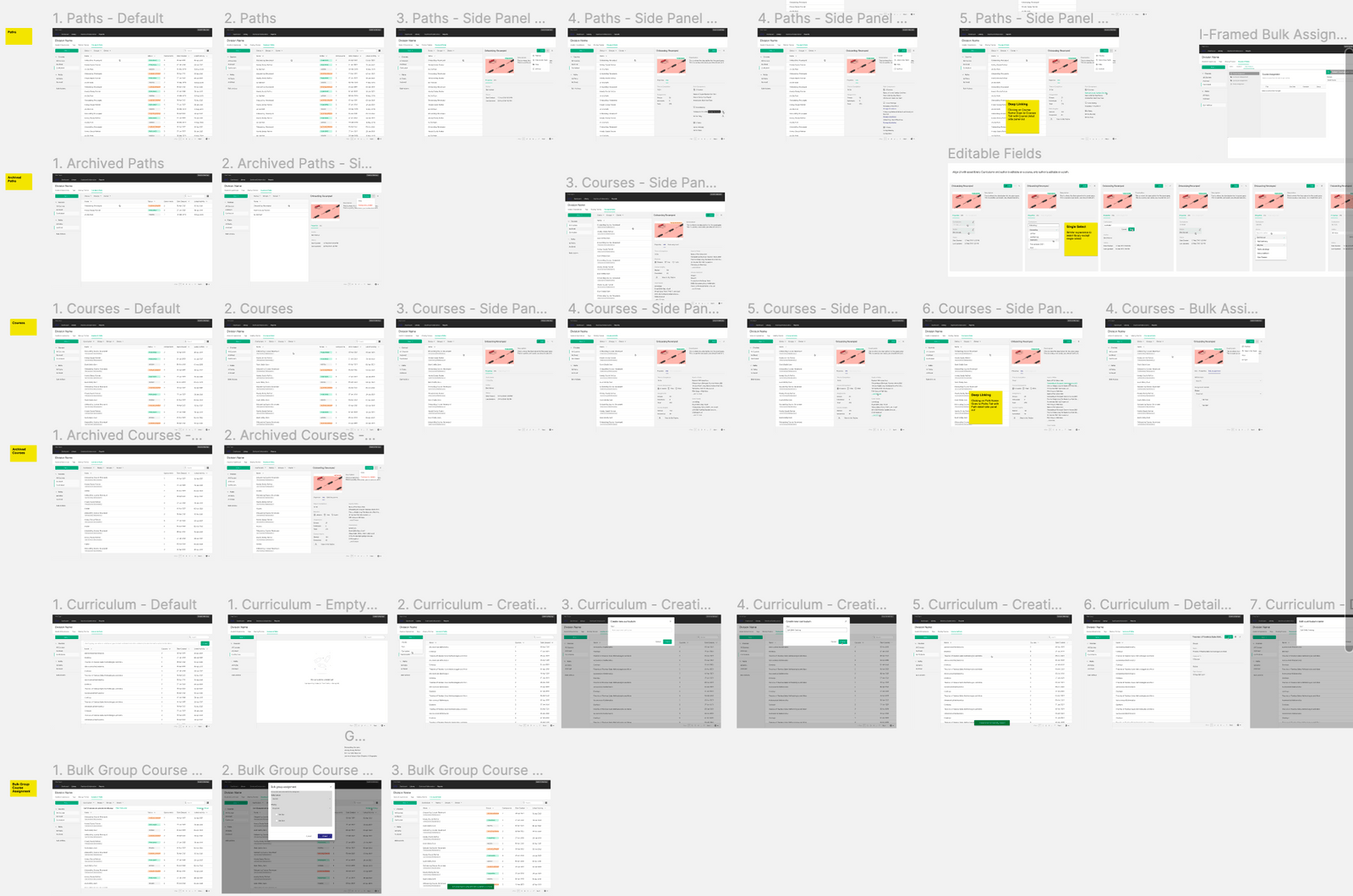
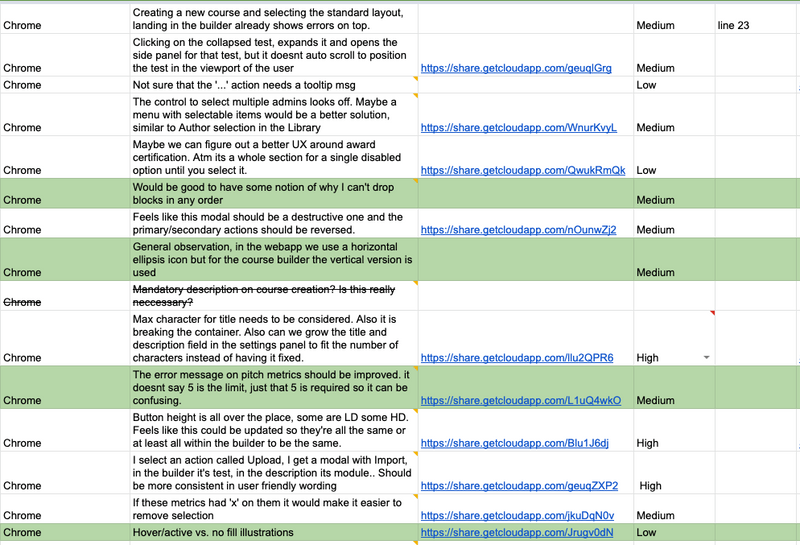
ex. of bug and improvement logging
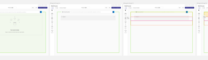
ex. of mocking drag and drop zones and interactions for developers to translate into an interactive POC for testing.
Beta and Play-Testing
With all the feedback and defining done, I took those into account when mocking up extensive flows, covering edge cases and being as detailed as conveying to developers how certain features should behave and animate. Playtests and Beta testing take place after every feature is implemented to catch bugs, odd behaviors etc before it is shipped to all users/customers.
06: Platform Alignment Achieved
Unified Platform UI/UX
Strategically delivered thoughtful re-designed features across product areas to reach a full integration across the 3 core areas of the platform.
- Creation
Coach (NEW)
Content
A course holds media but also tests & PitchIQs
A page holds media, text, etc components
- Storage
Coach (NEW)
Content
A course holds media but also tests & PitchIQs
A page holds media, text, etc components
- Consumption
Coach (NEW)
Content
A course holds media but also tests & PitchIQs
A page holds media, text, etc components
- Insights
New
Old
A course holds media but also tests & PitchIQs
A page holds media, text, etc components
Coach (Mobile)
- Ineffecient flow; steps are linear and require saving after each single one.
- Users want to a tool to build/draft them faster.
Conclusion
Key Results
customer complaint tickets
were reduced by about 20% through continuous UX improvements, quality of life features updates, and cross-platform product unification.
Showpad
shipped
Coach Integration
role
Lead Product Designer
Timeline
JAN 2025 - JUN 2026
Responsibilities
0 to 1 design ∙ user research ∙ design system
01: Business Case
Context
When LearnCore was acquired in 2018, there was a 9 month rush to "integrate" the products. Because of this timeline, there were many gaps and inconsistencies in UX, systems, and interactions between the LMS product and the rest of the Showpad platform, leading to frustration and a steep learning curve for users.
Goals
1. Create consistency in overall visual design
2. Align product concepts and architecture
3. Make sure UX and behavior patterns are cohesive
4. Reduce Coach and platform customer complaints
02: the Current State
User Interviews
Initial research interviews were done to understand the pain points users experience with the current implementation of all 4 products. Simultaneously we were also getting tickets from customers reporting some of these issues themselves. With this feedback we used it as a basis to validate a need for change & alignment while also considering for some specific use cases that the "content" product has not accounted for.
Screenshot of Showpad Meeting IQ transcription of user interviews.
Spreadsheet of user answers to interview questions.
03: IdentifIED Gaps
What is Coach?
Showpad "Coach" product is a sales team learning management system that consists of 4 major facets. Each facet, has a primary user persona.
- Creation
Admin
- Ineffecient flow; steps are linear and require saving after each single one.
- Users want to a tool to build/draft them faster.
Coach
Content
The creation of course and training materials done by the admin persona.
- Storage
Admin
- UI is very confusing and doesn't not aid with findability.
- Cross platform users are used to the content library UX and have to shift mindsets/learn a new pattern to use coach library.
Coach
Content
- Consumption
Sales Rep
- Users often miss the previous and next arrows in the header to navigate through learning content and use the sidebar instead.
- They believe they are complete but the UI is not which is confusing.
- Our customer's course creators actually ended up custom designing the first page to instructing users to use the top arrows... 😬
Coach
Content
- Insights
Sales Manager
- Managers wanted more user centric insights.
- The current insights spoke more towards the admin persona.
- The UI seemed "dirty" due to the overuse of shadows.
Coach (Only)
04: Unifying Patterns
Identifying Parallels
Parallels were drawn to identify opportunities for alignment. Any similar concept was should exist in the same place and behave the same way.
Coach
Content
Containers
A course holds media but also tests & PitchIQs
A page holds media, text, etc components
Components
Course components can be a section, lesson, test, survey, PitchIQ
Coach
Content
Information
Course info has no naming / title
“Details” tab next to comments.
Comments
"Discussion" button in header
“Comments” tab in side panel next to details
05: Design Refinement and Beta Testing
Design Refinement
With all the feedback and defining done, I took those into account when mocking up extensive flows, covering edge cases and being as detailed as conveying to developers how certain features should behave and animate.
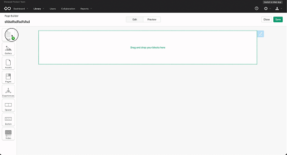
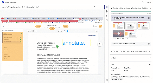
ex. of bug and improvement logging
ex. of mocking drag and drop zones and interactions for developers to translate into an interactive POC for testing.
Beta and Play-Testing
With all the feedback and defining done, I took those into account when mocking up extensive flows, covering edge cases and being as detailed as conveying to developers how certain features should behave and animate. Playtests and Beta testing take place after every feature is implemented to catch bugs, odd behaviors etc before it is shipped to all users/customers.
06: Platform Alignment Achieved
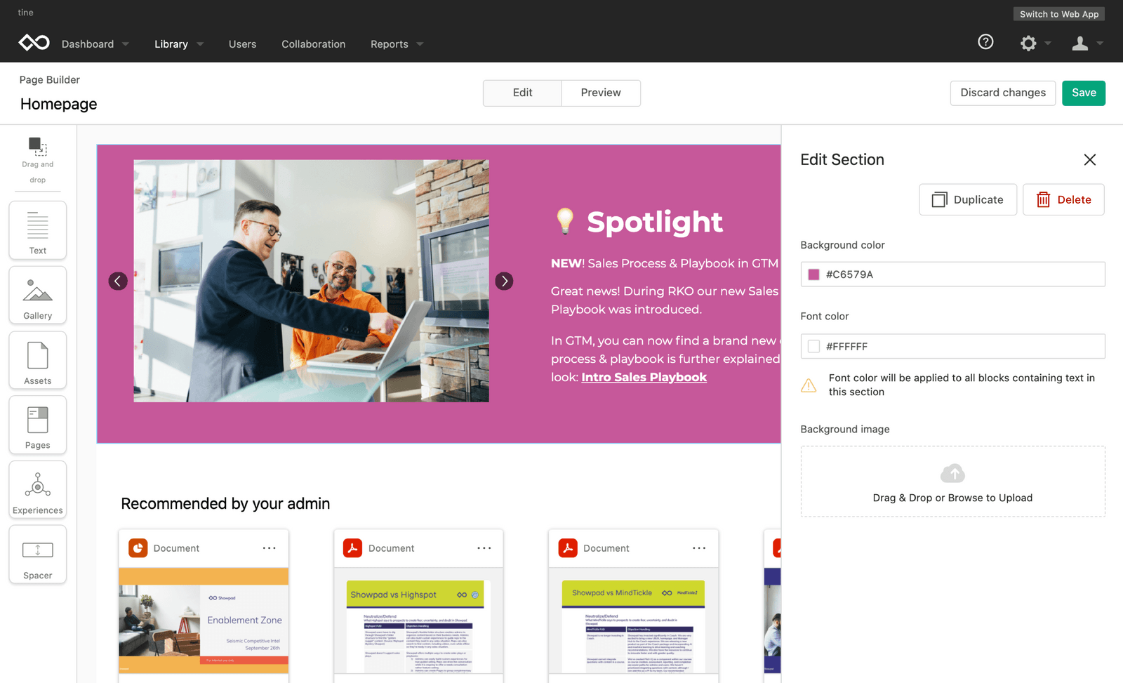
Unified Platform UI/UX
Strategically delivered thoughtful re-designed features across product areas to reach a full integration across the 3 core areas of the platform.
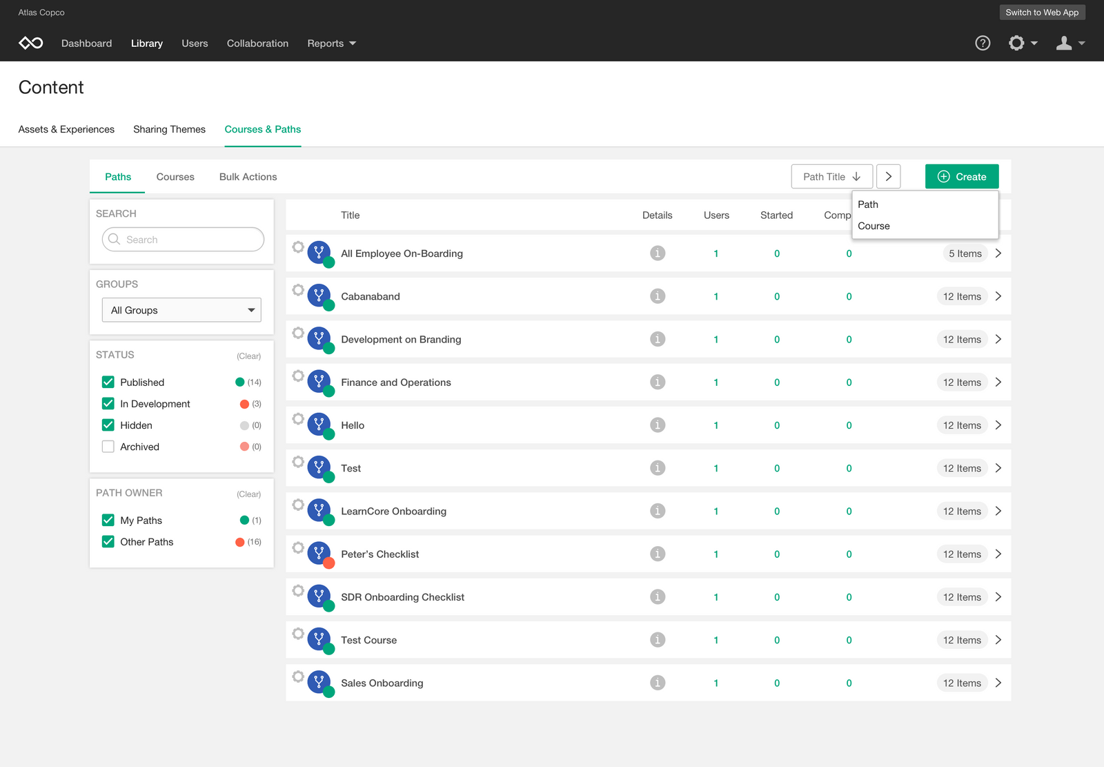
- Creation
Coach (NEW)
Content
A course holds media but also tests & PitchIQs
A page holds media, text, etc components
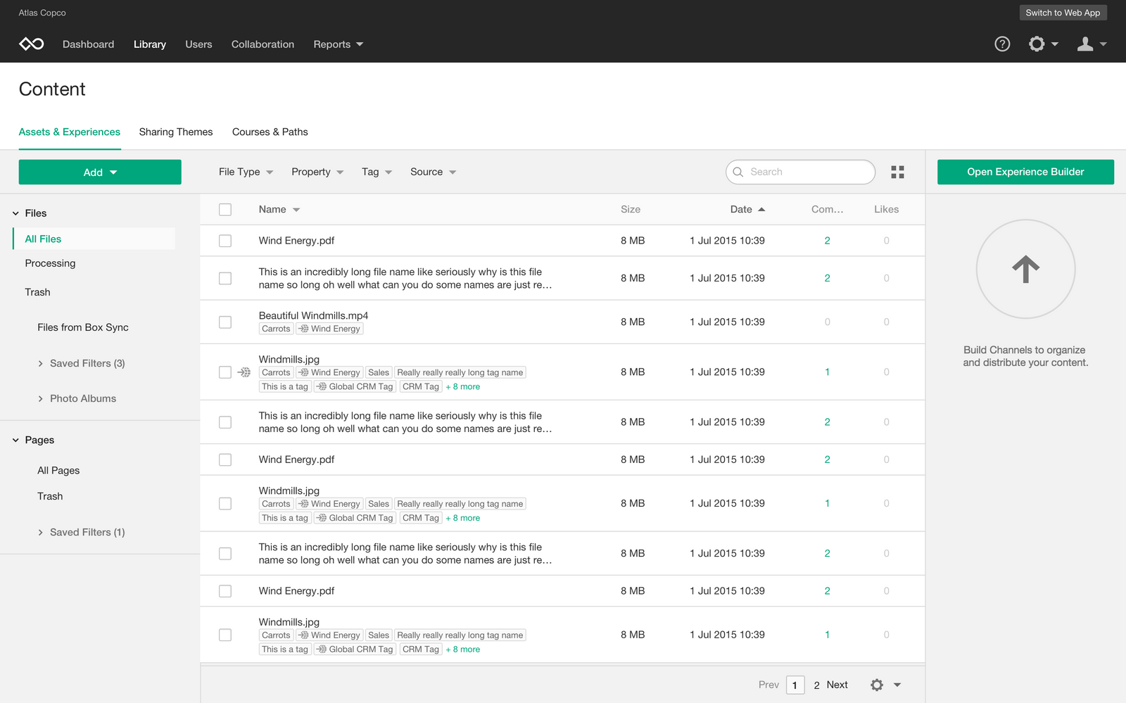
- Storage
Coach (NEW)
Content
A course holds media but also tests & PitchIQs
A page holds media, text, etc components
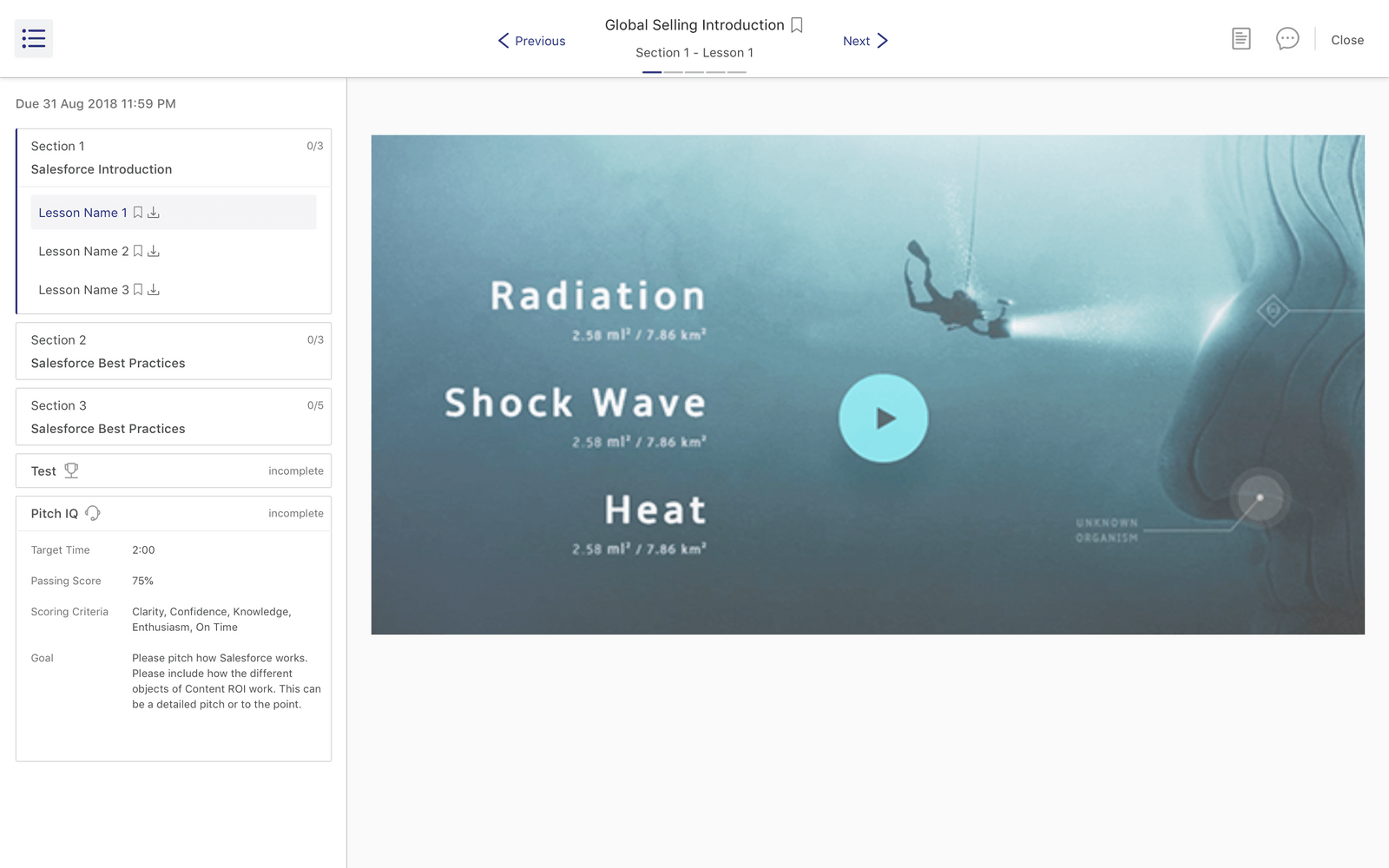
- Consumption
Coach (NEW)
Content
A course holds media but also tests & PitchIQs
A page holds media, text, etc components
- Insights
New
Old
A course holds media but also tests & PitchIQs
A page holds media, text, etc components
Coach (Mobile)
- Ineffecient flow; steps are linear and require saving after each single one.
- Users want to a tool to build/draft them faster.
Conclusion
Key Results
customer complaint tickets
were reduced by about 20% through continuous UX improvements, quality of life features updates, and cross-platform product unification.
Showpad
shipped
Coach Integration
role
Lead Product Designer
Timeline
JAN 2025 - JUN 2026
Responsibilities
0 to 1 design ∙ user research ∙ design system
01: Business Case
Context
When LearnCore was acquired in 2018, there was a 9 month rush to "integrate" the products. Because of this timeline, there were many gaps and inconsistencies in UX, systems, and interactions between the LMS product and the rest of the Showpad platform, leading to frustration and a steep learning curve for users.
Goals
1. Create consistency in overall visual design
2. Align product concepts and architecture
3. Make sure UX and behavior patterns are cohesive
4. Reduce Coach and platform customer complaints
02: the Current State
User Interviews
Initial research interviews were done to understand the pain points users experience with the current implementation of all 4 products. Simultaneously we were also getting tickets from customers reporting some of these issues themselves. With this feedback we used it as a basis to validate a need for change & alignment while also considering for some specific use cases that the "content" product has not accounted for.
Screenshot of Showpad Meeting IQ transcription of user interviews.
Spreadsheet of user answers to interview questions.
03: IdentifIED Gaps
What is Coach?
Showpad "Coach" product is a sales team learning management system that consists of 4 major facets. Each facet, has a primary user persona.
- Creation
Admin
- Inefficient flow; steps are linear and require saving after each single one.
- Users want to a tool to build/draft them faster.
Coach
Content
- Storage
Admin
- UI is very confusing and doesn't not aid with find-ability.
- Cross platform users are used to the content library UX and have to shift mindsets/learn a new pattern to use coach library.
Coach
Content
- Consumption
Sales Rep
- Users often miss the previous and next arrows in the header to navigate through learning content and use the sidebar instead.
- They believe they are complete but the UI is not which is confusing.
- Our customer's course creators actually ended up custom designing the first page to instructing users to use the top arrows... 😬
Coach
Content
- Insights
Sales Manager
- Managers wanted more user centric insights.
- The current insights spoke more towards the admin persona.
- The UI seemed "dirty" due to the overuse of shadows.
Coach (Only)
04: Unifying Patterns
Identifying Parallels
Parallels were drawn to identify opportunities for alignment. Any similar concept was should exist in the same place and behave the same way.
Coach
Content
Containers
A course holds media but also tests & PitchIQs
A page holds media, text, etc components
Components
Course components can be a section, lesson, test, survey, PitchIQ
Coach
Content
Information
Course info has no naming / title
“Details” tab next to comments.
Comments
"Discussion" button in header
“Comments” tab in side panel next to details
05: Design Refinement and Beta Testing
Design Refinement
With all the feedback and defining done, I took those into account when mocking up extensive flows, covering edge cases and being as detailed as conveying to developers how certain features should behave and animate.
ex. of bug and improvement logging
ex. of mocking drag and drop zones and interactions for developers to translate into an interactive POC for testing.
Beta and Play-Testing
Playtests took place after every feature is implemented to catch bugs, odd behaviors etc before it is shipped to all users/customers. A handful of priority customers participated in our beta testing program for final feedback before deployment.
06: Platform Alignment Achieved
Unified Platform UI/UX
Strategically delivered thoughtful re-designed features across product areas to reach a full integration across the 3 core areas of the platform.
- Creation
Coach (NEW)
Content
A course holds media but also tests & PitchIQs
A page holds media, text, etc components
- Storage
Coach (NEW)
Content
A course holds media but also tests & PitchIQs
A page holds media, text, etc components
- Consumption
Coach (NEW)
Content
A course holds media but also tests & PitchIQs
A page holds media, text, etc components
- Insights
New
Old
A course holds media but also tests & PitchIQs
A page holds media, text, etc components
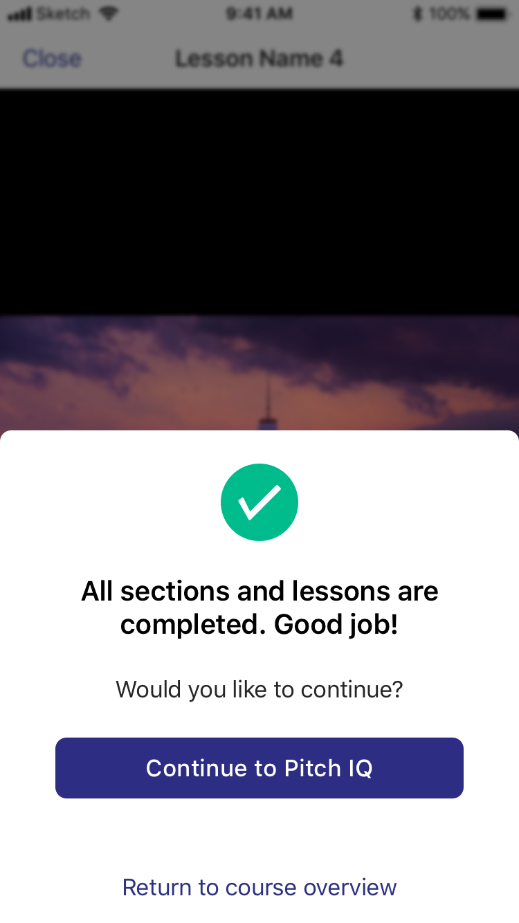
Coach (Mobile)
Cross platform unification was also addressed during this integration. The Showpad iOS app added coach capabilities to their existing content offering.
Conclusion
Key Results
customer complaint tickets
were reduced by about 20% through continuous UX improvements, quality of life features updates, and cross-platform product unification.
Showpad
shipped
Coach Integration
role
Lead Product Designer
Timeline
JAN 2025 - JUN 2026
Responsibilities
0 to 1 design ∙ user research ∙ design system
01: Business Case
Context
When LearnCore was acquired in 2018, there was a 9 month rush to "integrate" the products. Because of this timeline, there were many gaps and inconsistencies in UX, systems, and interactions between the LMS product and the rest of the Showpad platform, leading to frustration and a steep learning curve for users.
Goals
1. Create consistency in overall visual design
2. Align product concepts and architecture
3. Make sure UX and behavior patterns are cohesive
4. Reduce Coach and platform customer complaints
02: the Current State
User Interviews
Initial research interviews were done to understand the pain points users experience with the current implementation of all 4 products. Simultaneously we were also getting tickets from customers reporting some of these issues themselves. With this feedback we used it as a basis to validate a need for change & alignment while also considering for some specific use cases that the "content" product has not accounted for.
Screenshot of Showpad Meeting IQ transcription of user interviews.
Spreadsheet of user answers to interview questions.
03: IdentifIED Gaps
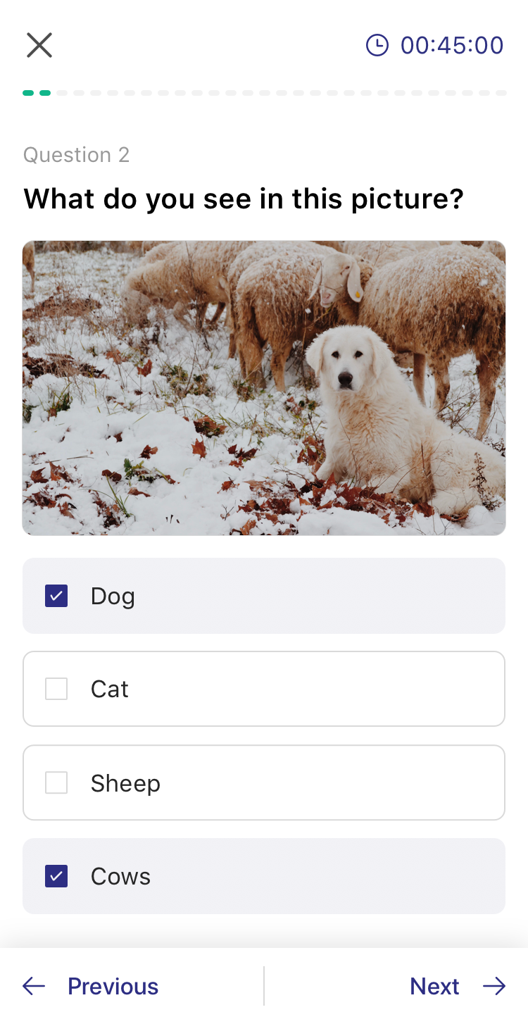
What is Coach?
Showpad "Coach" product is a sales team learning management system that consists of 4 major facets. Each facet, has a primary user persona.
- Creation
Admin
- Ineffecient flow; steps are linear and require saving after each single one.
- Users want to a tool to build/draft them faster.
Coach
Content
The creation of course and training materials done by the admin persona.
- Storage
Admin
- UI is very confusing and doesn't not aid with findability.
- Cross platform users are used to the content library UX and have to shift mindsets/learn a new pattern to use coach library.
Coach
Content
- Consumption
Sales Rep
- Users often miss the previous and next arrows in the header to navigate through learning content and use the sidebar instead.
- They believe they are complete but the UI is not which is confusing.
- Our customer's course creators actually ended up custom designing the first page to instructing users to use the top arrows... 😬
Coach
Content
- Insights
Sales Manager
- Managers wanted more user centric insights.
- The current insights spoke more towards the admin persona.
- The UI seemed "dirty" due to the overuse of shadows.
Coach (Only)
04: Unifying Patterns
Identifying Parallels
Parallels were drawn to identify opportunities for alignment. Any similar concept was should exist in the same place and behave the same way.
Coach
Content
Containers
A course holds media but also tests & PitchIQs
A page holds media, text, etc components
Components
Course components can be a section, lesson, test, survey, PitchIQ
Coach
Content
Information
Course info has no naming / title
“Details” tab next to comments.
Comments
"Discussion" button in header
“Comments” tab in side panel next to details
05: Design Refinement and Beta Testing
Design Refinement
With all the feedback and defining done, I took those into account when mocking up extensive flows, covering edge cases and being as detailed as conveying to developers how certain features should behave and animate.
ex. of bug and improvement logging
ex. of mocking drag and drop zones and interactions for developers to translate into an interactive POC for testing.
Beta and Play-Testing
With all the feedback and defining done, I took those into account when mocking up extensive flows, covering edge cases and being as detailed as conveying to developers how certain features should behave and animate. Playtests and Beta testing take place after every feature is implemented to catch bugs, odd behaviors etc before it is shipped to all users/customers.
06: Platform Alignment Achieved
Unified Platform UI/UX
Strategically delivered thoughtful re-designed features across product areas to reach a full integration across the 3 core areas of the platform.
- Creation
Coach (NEW)
Content
A course holds media but also tests & PitchIQs
A page holds media, text, etc components
- Storage
Coach (NEW)
Content
A course holds media but also tests & PitchIQs
A page holds media, text, etc components
- Consumption
Coach (NEW)
Content
A course holds media but also tests & PitchIQs
A page holds media, text, etc components
- Insights
New
Old
A course holds media but also tests & PitchIQs
A page holds media, text, etc components
Coach (Mobile)
- Ineffecient flow; steps are linear and require saving after each single one.
- Users want to a tool to build/draft them faster.
Conclusion
Key Results
customer complaint tickets
were reduced by about 20% through continuous UX improvements, quality of life features updates, and cross-platform product unification.