COATES GROUP ✦ Shipped
Spearheaded the first Design System UI Kit
Platform
0→1
Enterprise
I led design on a 0→1 internal intelligence platform — owning the strategy and the craft, and shipping v1 in five months.
Role
Lead Product Designer
Skills
0 → 1, user research, design system, accessibility
Team
1 PM, 4 Eng, me
Timeline
SEP 2025 - NOV 2026
OVERVIEW
From zero to a nationwide pilot as founding designer 👩💻
Coates Design Language is the first unified visual system for Coates' growing software portfolio. As lead product designer I took it from an audit of the mess to a published beta, owning the research and the system build.
Coates had stayed heads down shipping client work, so its software products each grew their own look with no shared system to hold them together. This was a 0 to 1 build with nothing to inherit.
OUTCOMES
A shared system behind every new product
The work shipped as a published UI kit of 65+ components, tokens, and guidelines the team now builds on, bringing real standardization to products that used to look nothing alike. It also made the business case strong enough to fund a coded design system repository, not just a Figma library.
The real shift was behavioral. Instead of each designer rebuilding buttons, inputs, and layouts their own way, everyone now pulls from one source, which is where the consistency and time savings actually come from.
30
days
of potential development waste avoided
65+
components
of potential engineering overhead saved
Business case
A growing product line with no shared identity
Coates' software portfolio was expanding from client specific tools toward client agnostic ones, but each product had its own look and feel. With an internal product roadmap taking shape, we needed one visual language that felt unified and memorable to users and customers.
Coates' software portfolio was expanding from client specific tools toward client agnostic ones, but each product had its own look and feel. With an internal product roadmap taking shape, we needed one visual language that felt unified and memorable to users and customers.
Goals
Reduce:
- revenue lost to outages
- support resolution time
- reactive maintenance cases
Improve:
- Issue detection
- display reliability
- self-service
- customer confidence
Current State
Auditing the mess before fixing it
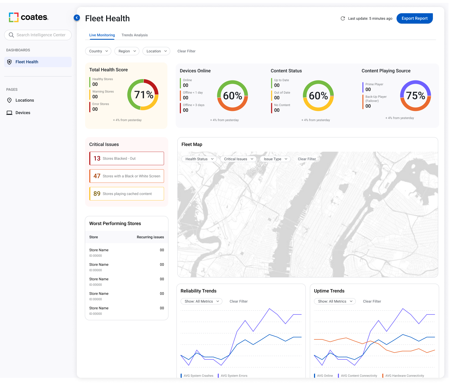
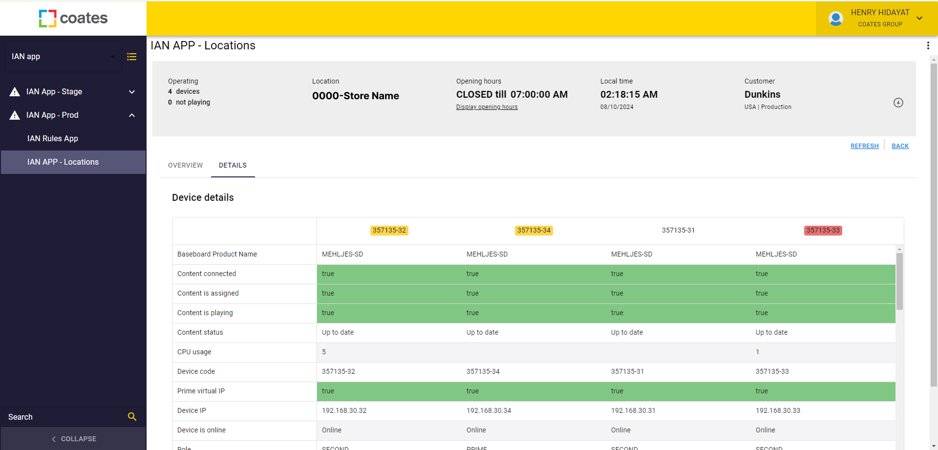
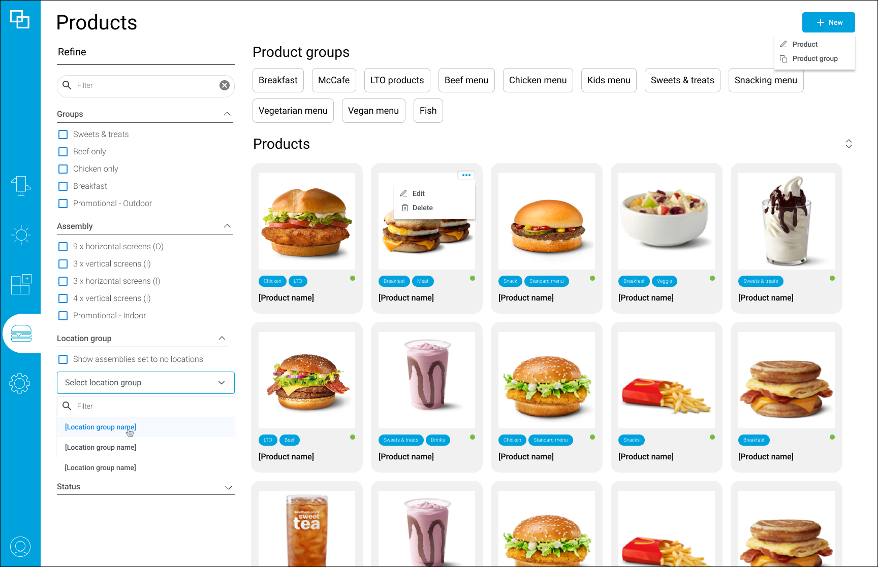
I audited every product across the portfolio to see where things had drifted apart. The picture was clear: isolated visual treatments, inconsistent UX patterns for the same actions, and almost no accessibility, with most UI elements failing standards.
SoFTWARE PORTFOLIO AUDIT
Internal support analytics
Bespoke client-specific CMS
Current client-agnostic CMS
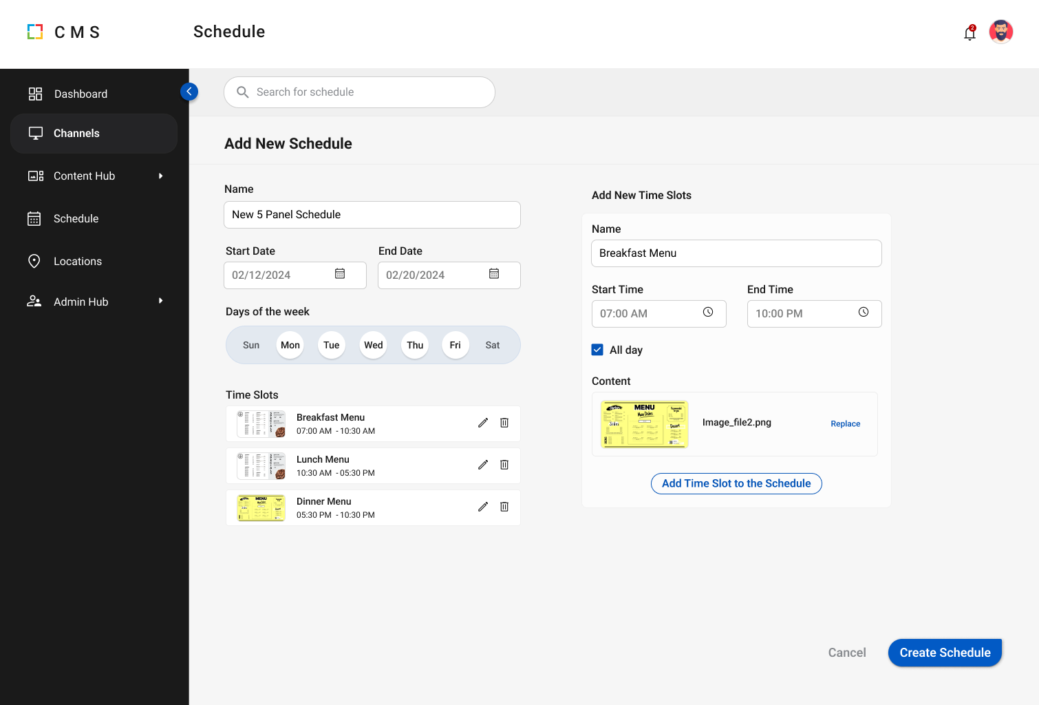
New client-agnostic CMS
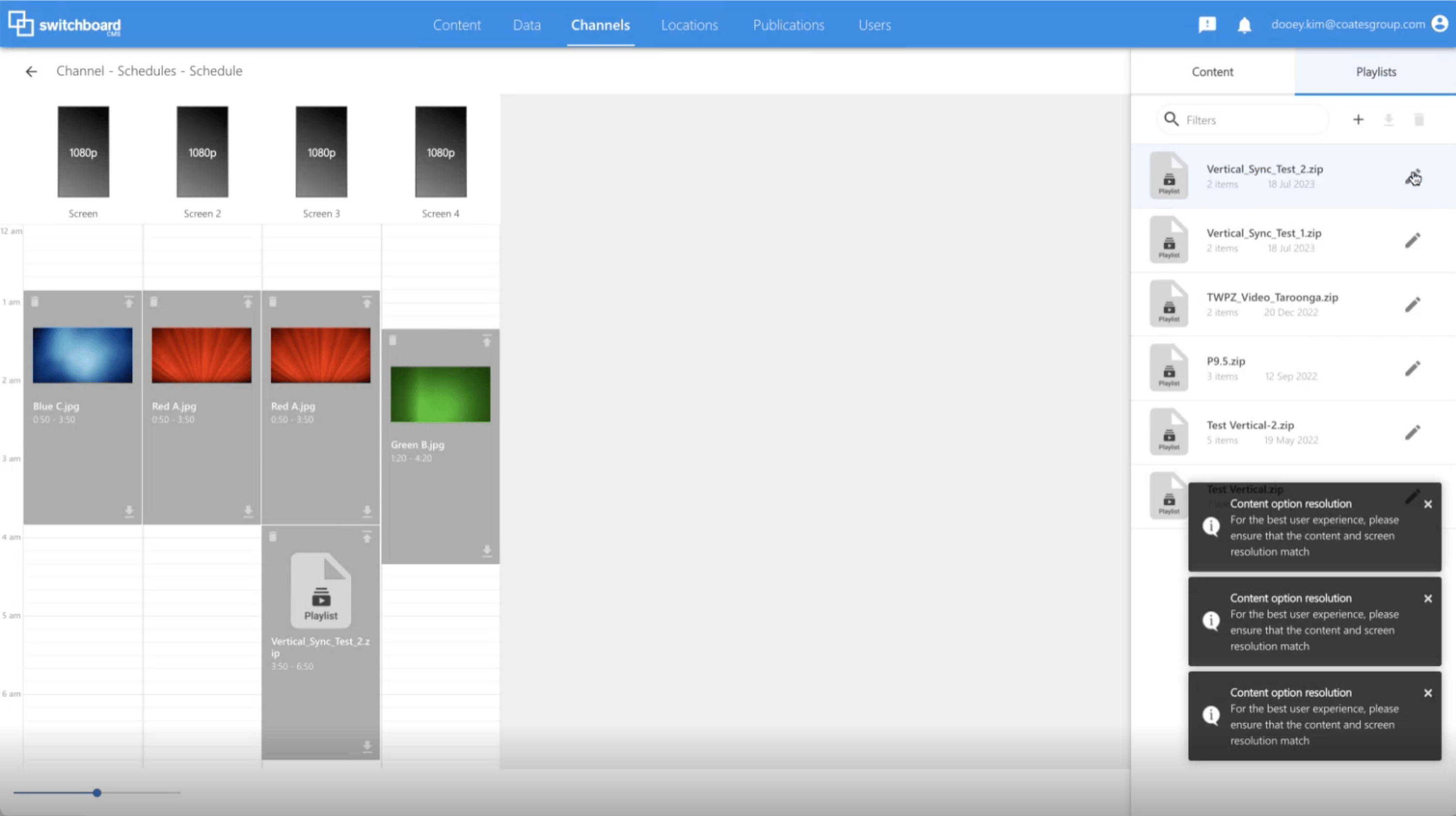
Current client-agnostic CMS
Identified Gaps
Instead of starting from zero, we mined the existing brand, marketing, and hardware systems for elements worth carrying into the new language. That gave it a head start and kept it recognizable to people already familiar with Coates.
Gap Analysis
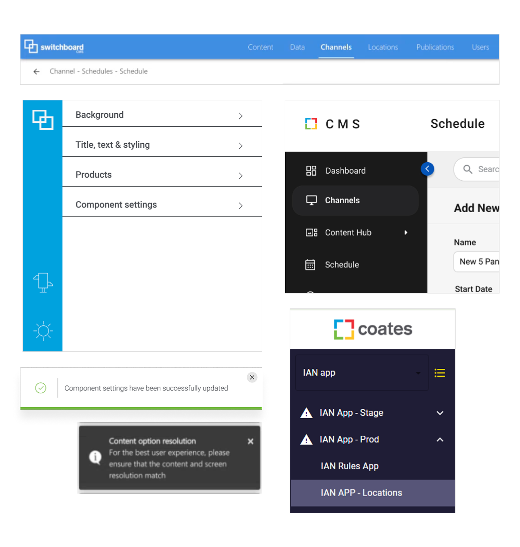
Visual One-Offs
Treatment of visual elements across products were vastly different. Each product was viewed as separate stand-alone with no clear identity.
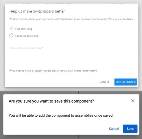
Inconsistent UX patterns
Behaviors and interactions across products also were disjointed. Users across products needed to perform different processes to achieve similar actions.
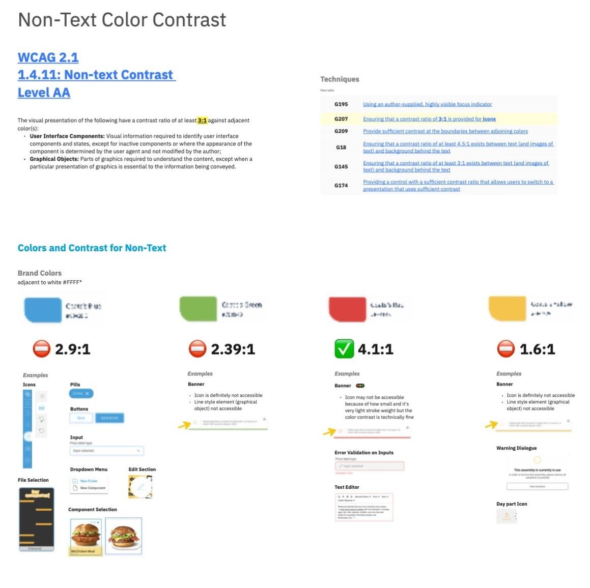
No Accessibility Best Practices
Off the bat, these existing products did not consider accessibility at all.
Existing Brand Language
Instead of starting from zero, we mined the existing brand, marketing, and hardware systems for elements worth carrying into the new language. That gave it a head start and kept it recognizable to people already familiar with Coates.
hardware vs. marketing visual language
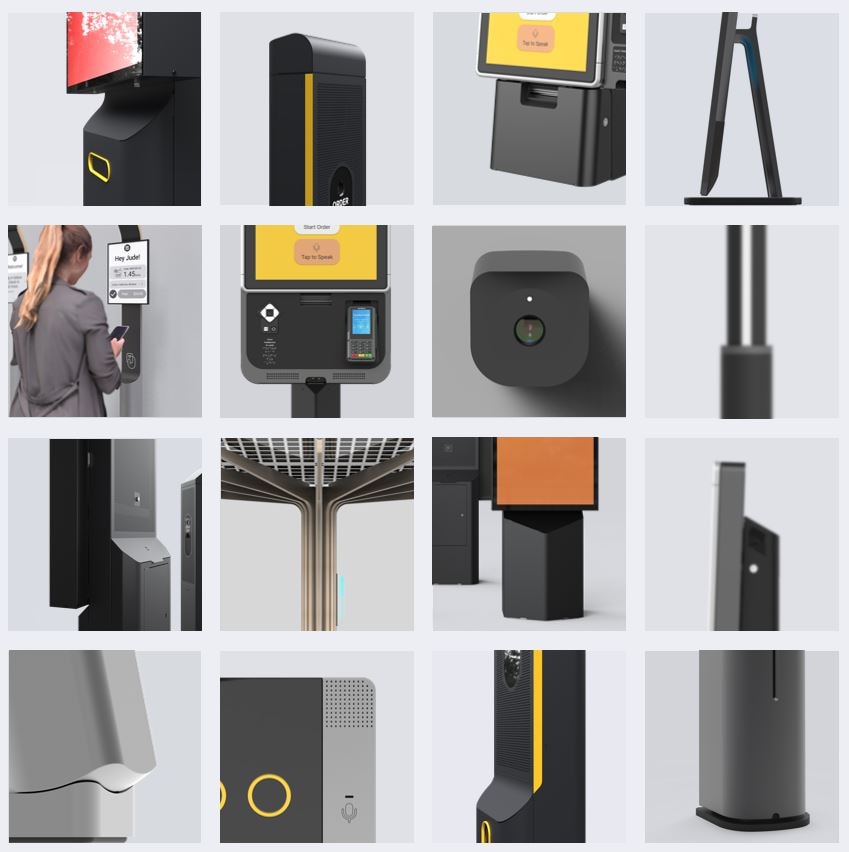
Hardware
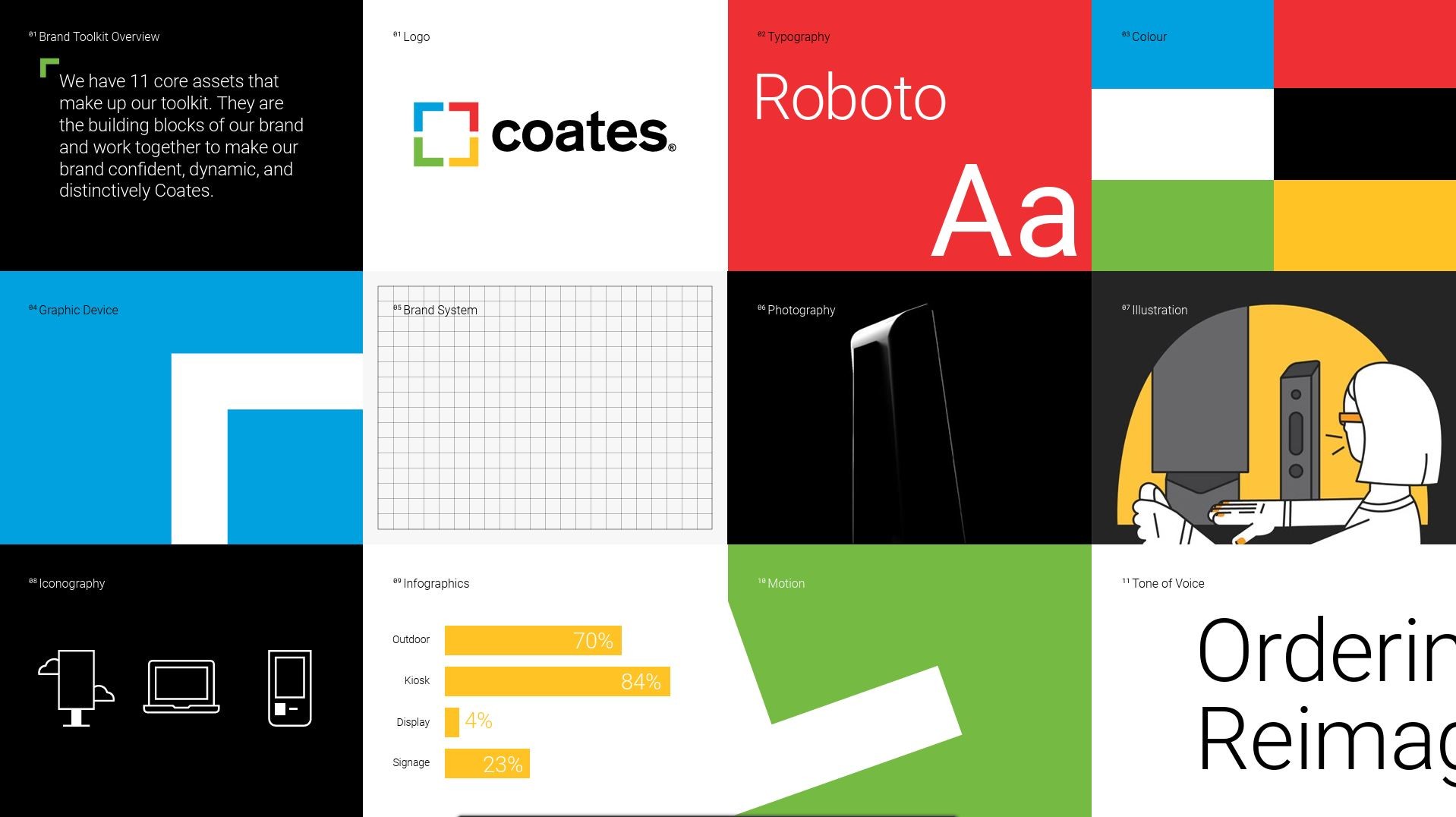
Marketing
Exploring product Identity
Two directions, built to be tested
Product and marketing design ran a few rapid ideation and feedback sprints, each contributing concepts off the audit. We deliberately visualized each concept on real product screens rather than abstract style tiles, so the feedback that came next was grounded in how the system would actually look in use.
cross design ORG exploration
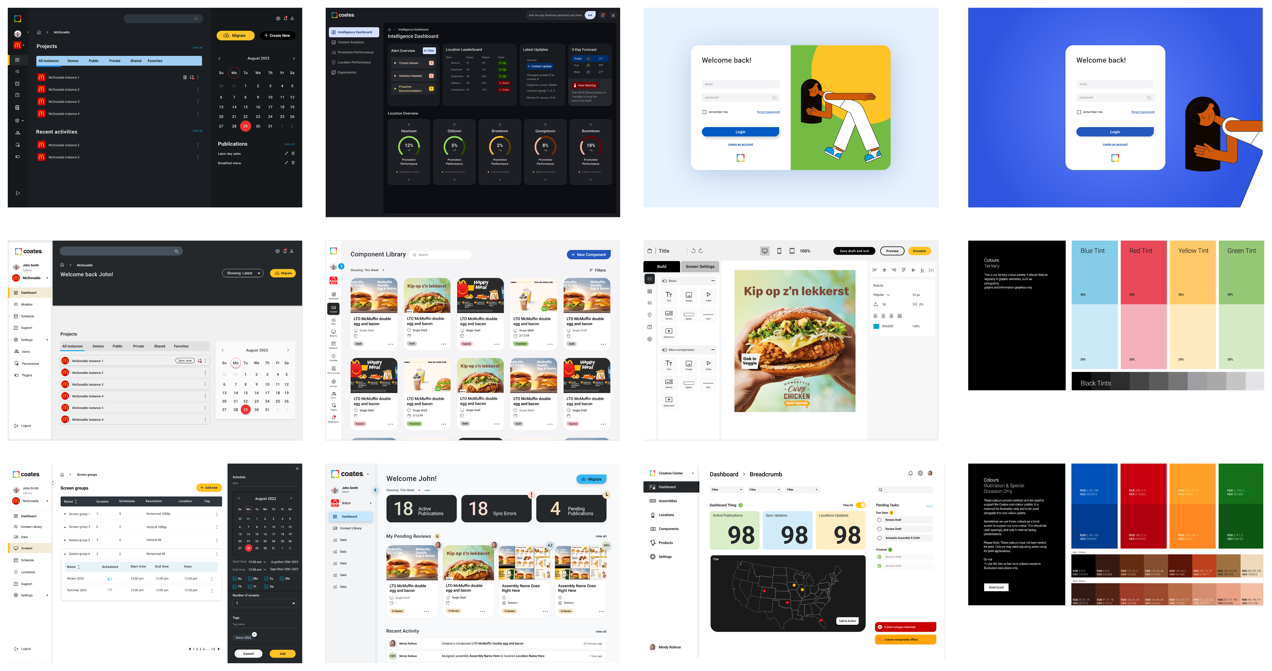
After rounds of critique we narrowed the cross design department explorations to two directions, Concept A and Concept B, mocked across sample screens for stakeholder feedback.
Refined Concepts for Testing
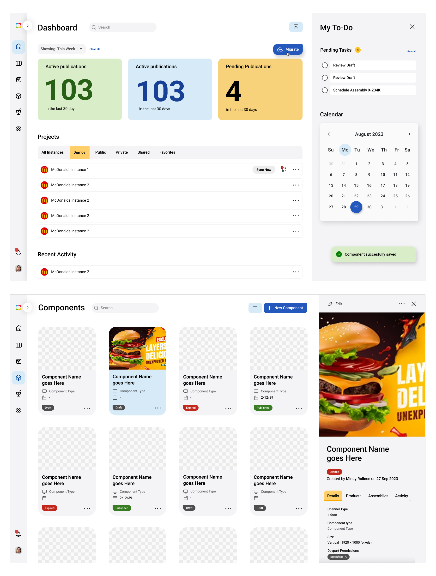
CONCEPT A
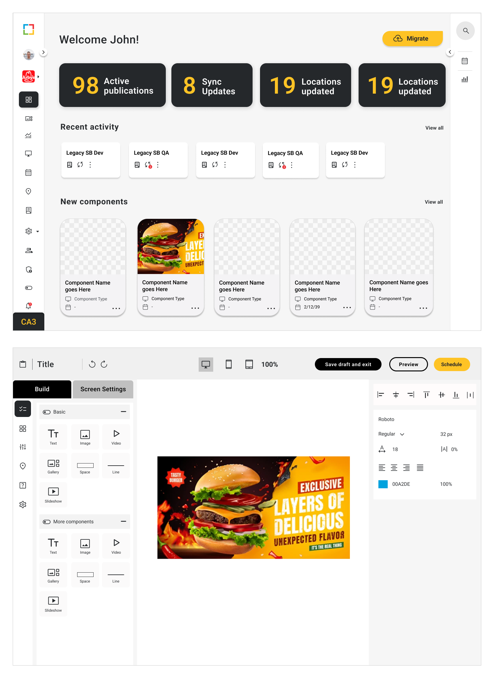
CONCEPT B
Stakeholder Interviews
16 stakeholder interviews
I wrote an interview guide and ran 16 sessions with stakeholders from every department, testing Concept A versus B and light versus dark. Three findings stood out: our brand yellow read too close to a major client, users wanted minimal breathable UI, and light theme won for clarity.
Interview guide
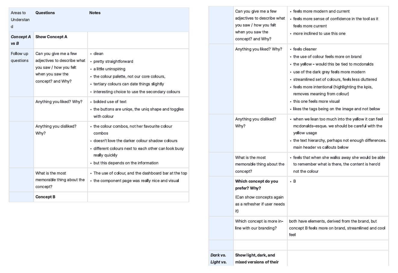
Key outcomes
The yellow was the sharpest signal. Building on it would have tied our client agnostic identity to one specific client, the opposite of the goal, which forced a genuine rethink of the primary color.
Key Outcomes
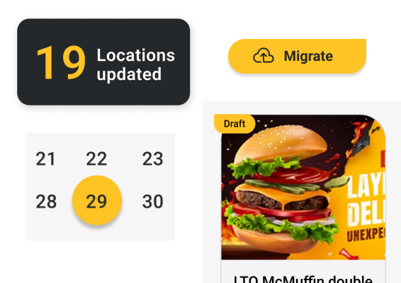
reconsider Primary color
Multiple users said that the use of our brand yellow as the primary color was too similar to one of our major clients; this was not aligned with our want of a strong client agnostic brand identity.
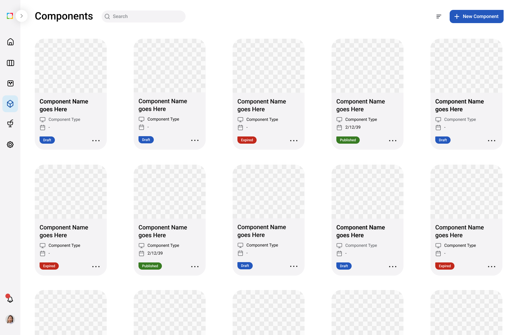
Minimal and breathable
Because a lot of digital products are heavily content and data focused, users preferred spacious and minimal UI that didn’t distract or overwhelm the content, media, or data.
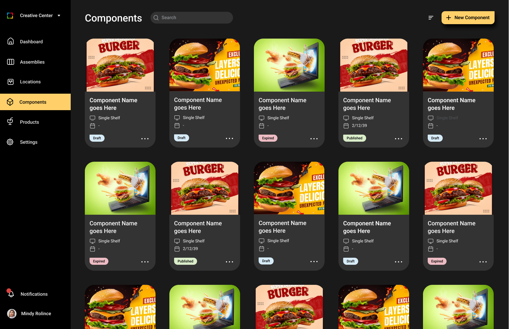
dark theme hides content
Users perceived a light theme to be cleaner, content and media pops more making it easier to digest. Whereas dark mode is heavy and consumes the content.
Defining our Identity
Four principles
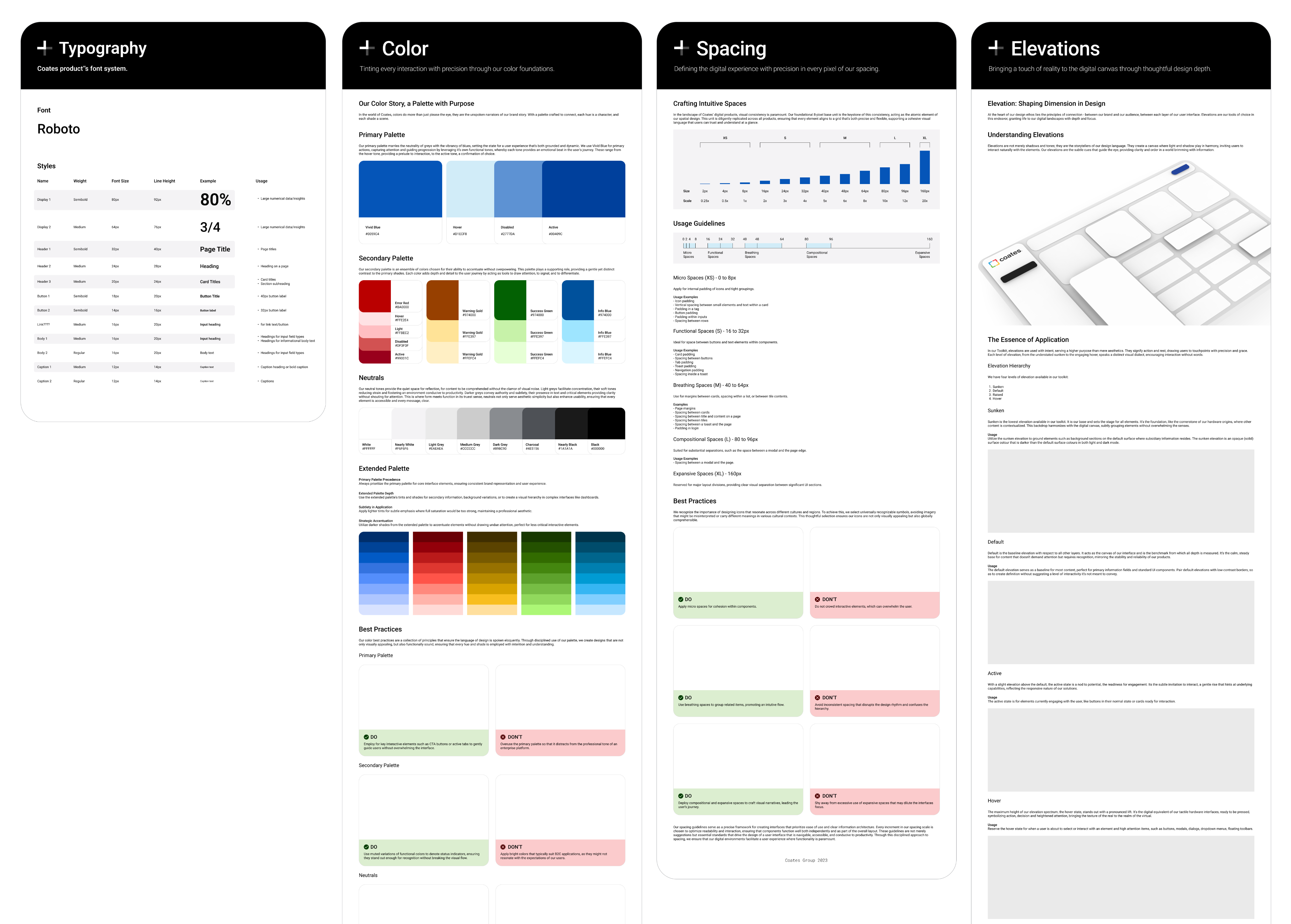
With the whole design team across product, brand, and hardware, we landed on four guiding principles: intuitive, intentional, interconnected, and inviting. From there I built the beta foundations first, type, color, and spacing, then components, then page templates.
Design principles

Intuitive
Anticipates what users need, when they need it.

Intentional
Every element has a purpose.

Interconnected
Unified across hardware, brand, and digital.
Inviting
Warm, accessible, and inviting.
Coates Design Language BETA
With the whole design team across product, brand, and hardware, we landed on four guiding principles: intuitive, intentional, interconnected, and inviting. From there I built the beta foundations first, type, color, and spacing, then components, then page templates.
Coates Design Language BETA
Foundations
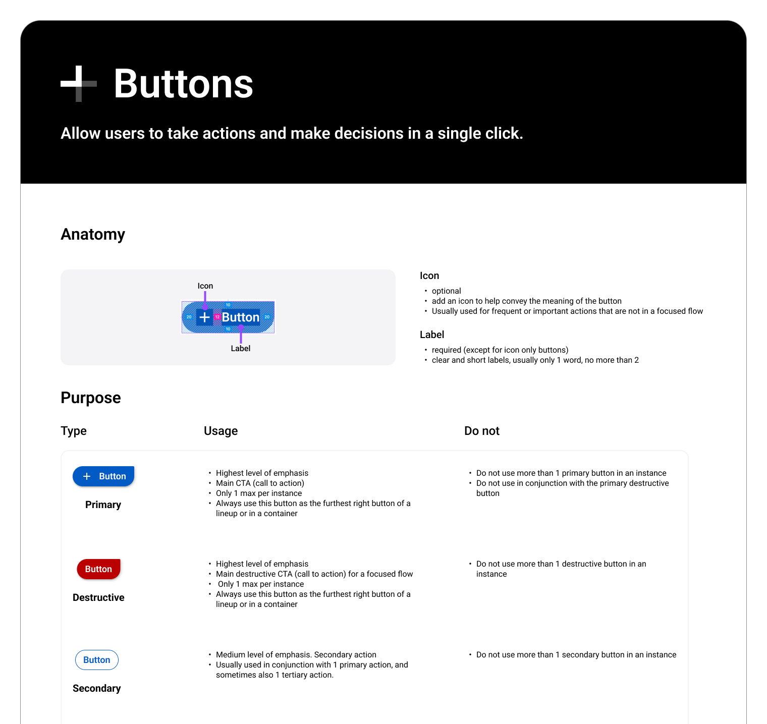
Components
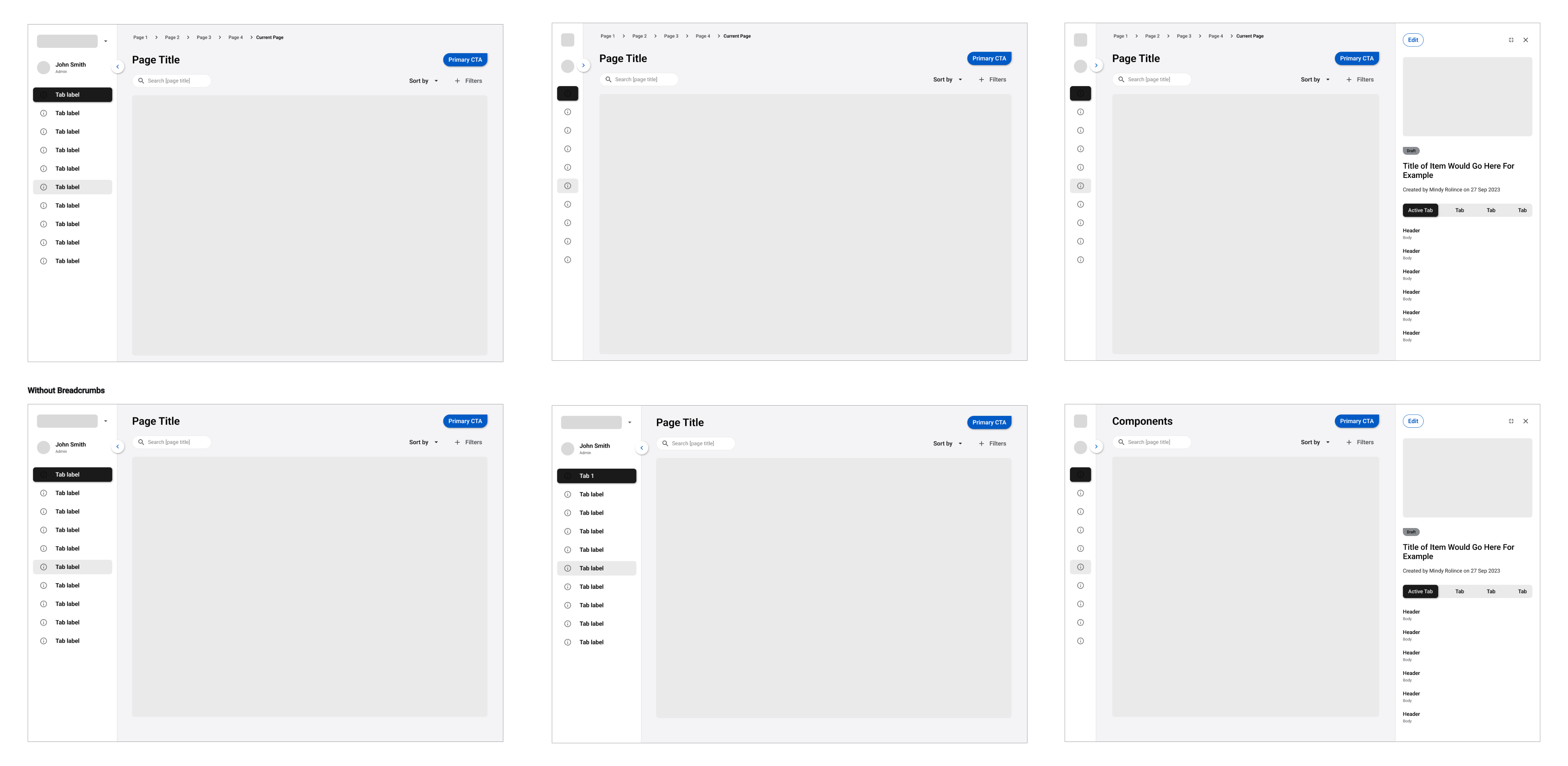
Page Templates
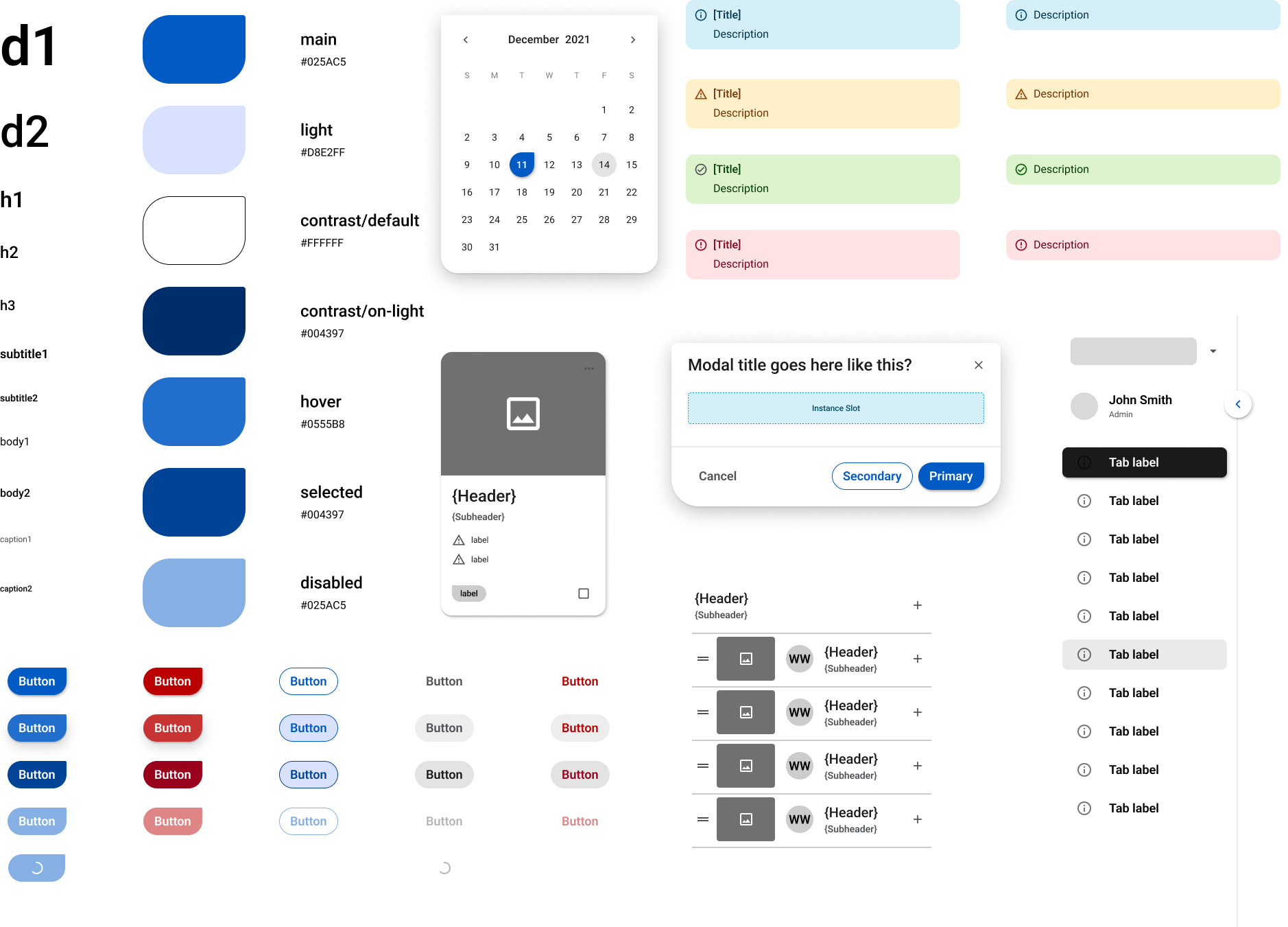
Sample collage of beta components and tokens.
Evolution of our Identity
Stress testing the kit in real work
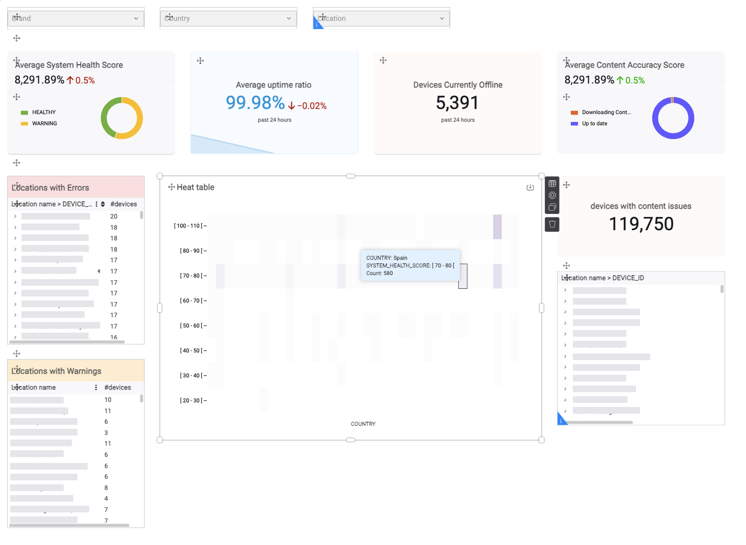
Once the beta UI kit was published, the whole design team put it to work in live projects to see if it held up. It ran in a drive thru customer identification POC and a new CMS mockup, both on CDL 1.0.
Initial prototype
Caption Title
Caption description goes here
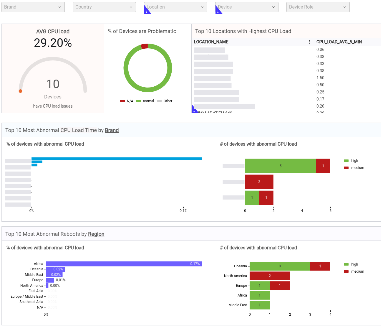
Caption Title
Caption description goes here
Bridging the Gap Between Existing and New Products
For older products, the Creative Center team refreshed their UI with MUI components and onboarded the CDL colors first. Swapping their one off components for a ready made library makes the eventual move to CDL far less painful.
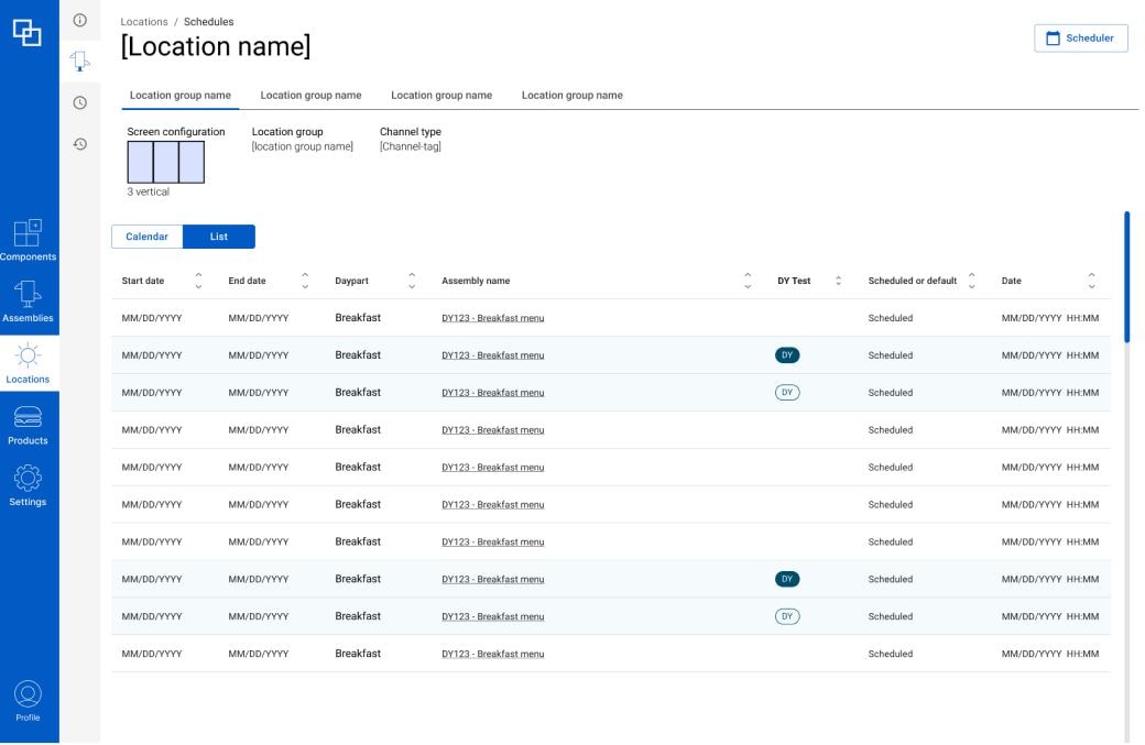
Creative Center adopting CDL 1.0
Coates Design Language 2.0
Coates Design Language 2.0
After 6+ months of testing, the beta matured into CDL 2.0. I had moved to a new team by then, so another designer led it while I stayed on as a stakeholder and support, and the beta's DNA is still visible throughout.
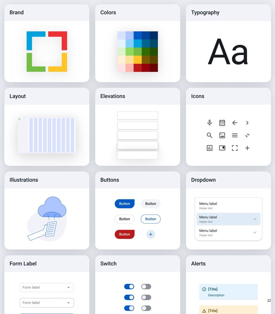
Coates Design Language 2.0
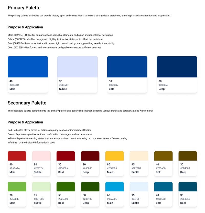
Evolution of our color palette
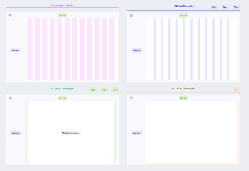
Solidified page layout and spacing
Signature teardrop shape
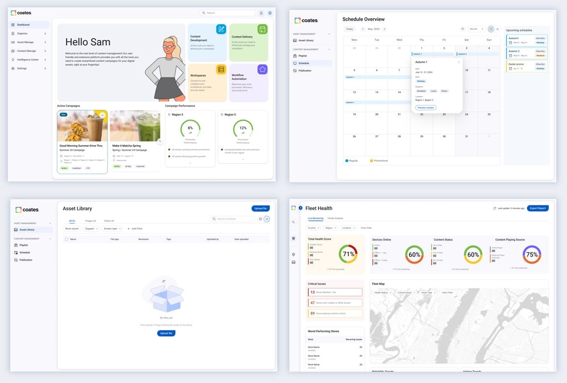
CDL 2.0 now backs four new products in design and development, including the shipped Intelligence Center. Craft details like the signature teardrop shape and asymmetrical corner radius tie the digital system straight back to the hardware form.
CDL 2.0 ACROSS NEW PRODUCTS
REFLECTION
Building a stronger case for building the code repository
The hardest part of a design system isn't designing it, it's getting non-designers to use it. The design team was very much in alignment, but getting financial and development investment to bring the design system to life took longer than expected.
COATES GROUP ✦ Shipped
Spearheaded the first Design System UI Kit
Platform
0→1
Enterprise
I led design on a 0→1 internal intelligence platform — owning the strategy and the craft, and shipping v1 in five months.
Role
Lead Product Designer
Skills
0 → 1, user research, design system, accessibility
Team
1 PM, 4 Eng, me
Timeline
SEP 2025 - NOV 2026
← Back
Summary
Deep Dive
OVERVIEW
From zero to a nationwide pilot as founding designer 👩💻
Coates Design Language is the first unified visual system for Coates' growing software portfolio. As lead product designer I took it from an audit of the mess to a published beta, owning the research and the system build.
Coates had stayed heads down shipping client work, so its software products each grew their own look with no shared system to hold them together. This was a 0 to 1 build with nothing to inherit.
OUTCOMES
A shared system behind every new product
The work shipped as a published UI kit of 65+ components, tokens, and guidelines the team now builds on, bringing real standardization to products that used to look nothing alike. It also made the business case strong enough to fund a coded design system repository, not just a Figma library.
The real shift was behavioral. Instead of each designer rebuilding buttons, inputs, and layouts their own way, everyone now pulls from one source, which is where the consistency and time savings actually come from.
30
days
of potential development waste avoided
65+
components
of potential engineering overhead saved
Business case
A growing product line with no shared identity
Coates' software portfolio was expanding from client specific tools toward client agnostic ones, but each product had its own look and feel. With an internal product roadmap taking shape, we needed one visual language that felt unified and memorable to users and customers.
Coates' software portfolio was expanding from client specific tools toward client agnostic ones, but each product had its own look and feel. With an internal product roadmap taking shape, we needed one visual language that felt unified and memorable to users and customers.
Goals
Reduce:
- revenue lost to outages
- support resolution time
- reactive maintenance cases
Improve:
- Issue detection
- display reliability
- self-service
- customer confidence
Current State
Auditing the mess before fixing it
I audited every product across the portfolio to see where things had drifted apart. The picture was clear: isolated visual treatments, inconsistent UX patterns for the same actions, and almost no accessibility, with most UI elements failing standards.
SoFTWARE PORTFOLIO AUDIT
Internal support analytics
Bespoke client-specific CMS
New client-agnostic CMS
Identified Gaps
Instead of starting from zero, we mined the existing brand, marketing, and hardware systems for elements worth carrying into the new language. That gave it a head start and kept it recognizable to people already familiar with Coates.
Gap Analysis
Visual One-Offs
Treatment of visual elements across products were vastly different. Each product was viewed as separate stand-alone with no clear identity.
Inconsistent UX patterns
Behaviors and interactions across products also were disjointed. Users across products needed to perform different processes to achieve similar actions.
No Accessibility Best Practices
Off the bat, these existing products did not consider accessibility at all.
Existing Brand Language
Instead of starting from zero, we mined the existing brand, marketing, and hardware systems for elements worth carrying into the new language. That gave it a head start and kept it recognizable to people already familiar with Coates.
hardware vs. marketing visual language
Hardware
Marketing
Exploring product Identity
Two directions, built to be tested
Product and marketing design ran a few rapid ideation and feedback sprints, each contributing concepts off the audit. We deliberately visualized each concept on real product screens rather than abstract style tiles, so the feedback that came next was grounded in how the system would actually look in use. After rounds of critique we narrowed to two directions, Concept A and Concept B, mocked across sample screens for stakeholder feedback.
Use cases and feature mapping
After rounds of critique we narrowed the cross design department explorations to two directions, Concept A and Concept B, mocked across sample screens for stakeholder feedback.
cross design exploration
CONCEPT A
CONCEPT B
Stakeholder Interviews
16 stakeholder interviews
I wrote an interview guide and ran 16 sessions with stakeholders from every department, testing Concept A versus B and light versus dark. Three findings stood out: our brand yellow read too close to a major client, users wanted minimal breathable UI, and light theme won for clarity.
Interview guide
Key outcomes
The yellow was the sharpest signal. Building on it would have tied our client agnostic identity to one specific client, the opposite of the goal, which forced a genuine rethink of the primary color.
wIREFRAMES
reconsider Primary color
Multiple users said that the use of our brand yellow as the primary color was too similar to one of our major clients; this was not aligned with our want of a strong client agnostic brand identity.
Minimal and breathable
Because a lot of digital products are heavily content and data focused, users preferred spacious and minimal UI that didn’t distract or overwhelm the content, media, or data.
dark theme hides content
Users perceived a light theme to be cleaner, content and media pops more making it easier to digest. Whereas dark mode is heavy and consumes the content.
Defining our Identity
Four principles
The principles were there to break ties on hard calls, not to decorate a slide. Building bottom up from foundations to templates kept the system coherent instead of a stack of one off screens.
Initial prototype
Intuitive
Anticipates what users need, when they need it.
Intentional
Every element has a purpose.
connected
Unified across hardware, brand, and digital.
Inviting
Warm, accessible, and inviting.
Coates Design Language BETA
With the whole design team across product, brand, and hardware, we landed on four guiding principles: intuitive, intentional, interconnected, and inviting. From there I built the beta foundations first, type, color, and spacing, then components, then page templates.
Coates Design Language BETA
Foundations
Components
Page Templates
Sample collage of beta components and tokens.
Evolution of our Identity
Stress testing the kit in real work
Once the beta UI kit was published, the whole design team put it to work in live projects to see if it held up. It ran in a drive thru customer identification POC and a new CMS mockup, both on CDL 1.0.
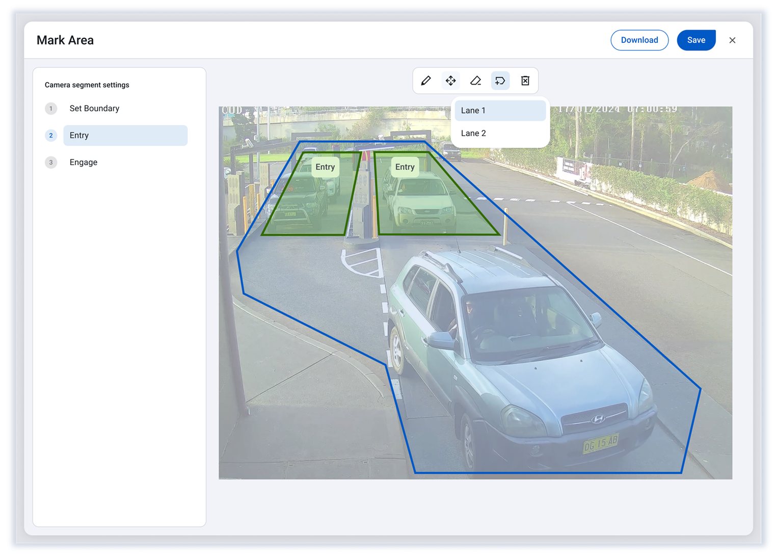
Drive-thru customer identification POC with CDL 1.0
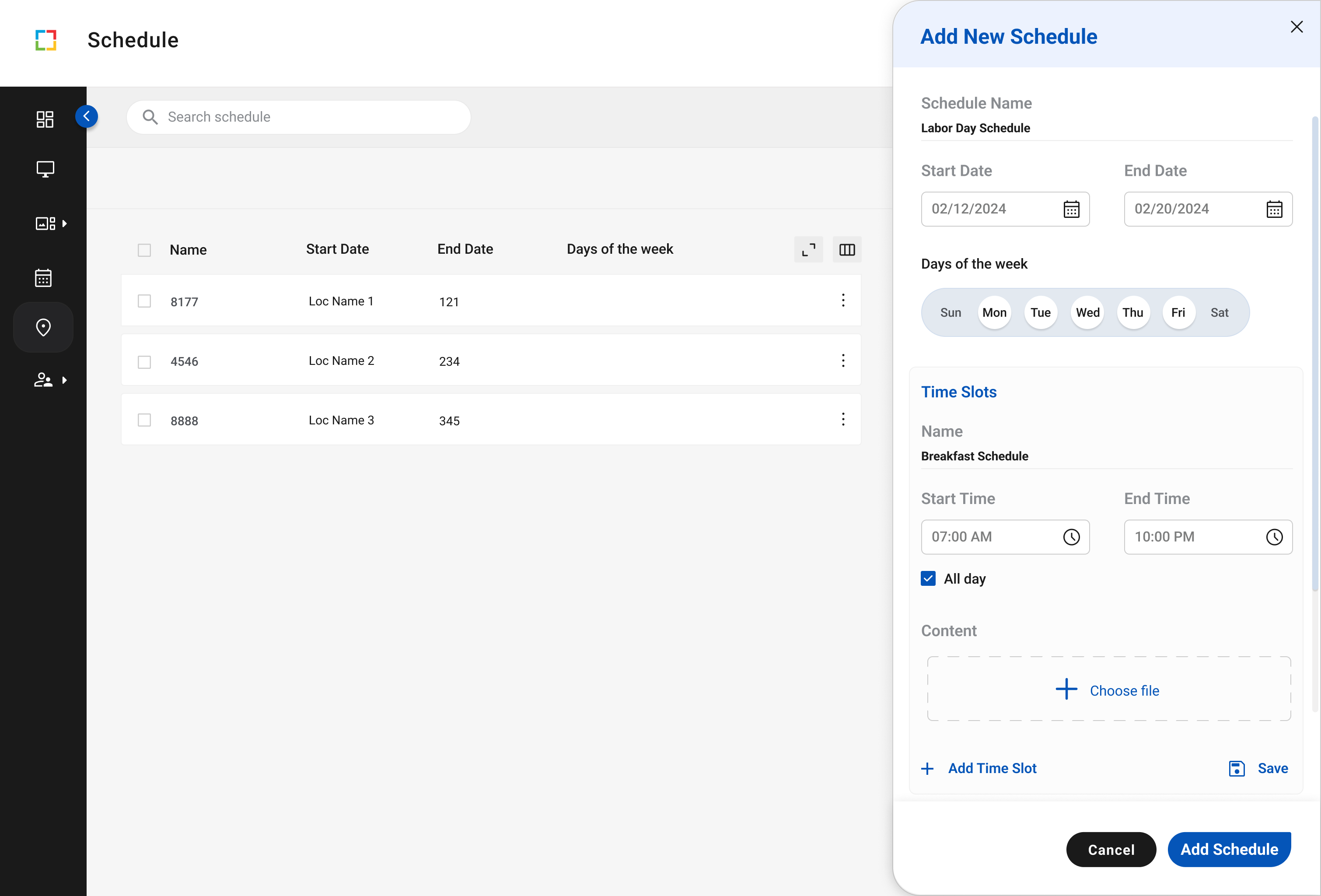
New CMS mock up with CDL 1.0
Bridging the Gap Between Existing and New Products
For older products, the Creative Center team refreshed their UI with MUI components and onboarded the CDL colors first. Swapping their one off components for a ready made library makes the eventual move to CDL far less painful.
Creative Center adopting CDL 1.0
Coates Design Language 2.0
Coates Design Language 2.0
After 6+ months of testing, the beta matured into CDL 2.0. I had moved to a new team by then, so another designer led it while I stayed on as a stakeholder and support, and the beta's DNA is still visible throughout.
Coates Design Language 2.0
Evolution of our color palette
Solidified page layout and spacing
Signature teardrop shape
CDL 2.0 now backs four new products in design and development, including the shipped Intelligence Center. Craft details like the signature teardrop shape and asymmetrical corner radius tie the digital system straight back to the hardware form.
CDL 2.0 ACROSS NEW PRODUCTS
REFLECTION
Building a stronger case for building the code repository
The hardest part of a design system isn't designing it, it's getting non-designers to use it. The design team was very much in alignment, but getting financial and development investment to bring the design system to life took longer than expected.
COATES GROUP ✦ Shipped
Spearheaded the first Design System UI Kit
Platform
0→1
Enterprise
I led design on a 0→1 internal intelligence platform — owning the strategy and the craft, and shipping v1 in five months.
Role
Lead Product Designer
Skills
0 → 1, user research, design system, accessibility
Team
1 PM, 4 Eng, me
Timeline
JUN 2024 - MAR 2025
Summary
Deep Dive
OVERVIEW
One brand across hardware, software, and screens
Coates Design Language is the first unified visual system for Coates' growing software portfolio. As lead product designer I took it from an audit of the mess to a published beta, owning the research and the system build.
Coates had stayed heads down shipping client work, so its software products each grew their own look with no shared system to hold them together. This was a 0 to 1 build with nothing to inherit.
OUTCOMES
A shared system behind every new product
The work shipped as a published UI kit of 65+ components, tokens, and guidelines the team now builds on, bringing real standardization to products that used to look nothing alike. It also made the business case strong enough to fund a coded design system repository, not just a Figma library.
The real shift was behavioral. Instead of each designer rebuilding buttons, inputs, and layouts their own way, everyone now pulls from one source, which is where the consistency and time savings actually come from.
$$$
funding
for design system repository build team
65+
components
along with tokens, and guidelines published
Business case
A growing product line with no shared identity
Coates' software portfolio was expanding from client specific tools toward client agnostic ones, but each product had its own look and feel. With an internal product roadmap taking shape, we needed one visual language that felt unified and memorable to users and customers.
The brand and hardware lines were already well established and distinct. Software was where the identity fell apart, so the mandate was unification, not a fresh coat of paint.
Goals
Reduce:
- revenue lost to outages
- support resolution time
- reactive maintenance cases
Improve:
- Issue detection
- display reliability
- self-service
- customer confidence
Current State
Auditing the mess before fixing it
I audited every product across the portfolio to see where things had drifted apart. The picture was clear: isolated visual treatments, inconsistent UX patterns for the same actions, and almost no accessibility, with most UI elements failing standards.
SoFTWARE PORTFOLIO AUDIT
Internal support analytics
Bespoke client-specific CMS
New client-agnostic CMS
Identified Gaps
Instead of starting from zero, we mined the existing brand, marketing, and hardware systems for elements worth carrying into the new language. That gave it a head start and kept it recognizable to people already familiar with Coates.
Gap Analysis
Visual One-Offs
Treatment of visual elements across products were vastly different. Each product was viewed as separate stand-alone with no clear identity.
Inconsistent UX patterns
Behaviors and interactions across products also were disjointed. Users across products needed to perform different processes to achieve similar actions.
No Accessibility Best Practices
Off the bat, these existing products did not consider accessibility at all.
Existing Brand Language
Instead of starting from zero, we mined the existing brand, marketing, and hardware systems for elements worth carrying into the new language. That gave it a head start and kept it recognizable to people already familiar with Coates.
hardware vs. marketing visual language
Hardware
Marketing
Exploring product Identity
Two directions, built to be tested
Product and marketing design ran a few rapid ideation and feedback sprints, each contributing concepts off the audit. We deliberately visualized each concept on real product screens rather than abstract style tiles, so the feedback that came next was grounded in how the system would actually look in use.
cross design ORG exploration
After rounds of critique we narrowed the cross design department explorations to two directions, Concept A and Concept B, mocked across sample screens for stakeholder feedback.
Refined Concepts for Testing
CONCEPT A
CONCEPT B
Stakeholder Interviews
16 stakeholder interviews
I wrote an interview guide and ran 16 sessions with stakeholders from every department, testing Concept A versus B and light versus dark. Three findings stood out: our brand yellow read too close to a major client, users wanted minimal breathable UI, and light theme won for clarity.
Interview guide
Key outcomes
The yellow was the sharpest signal. Building on it would have tied our client agnostic identity to one specific client, the opposite of the goal, which forced a genuine rethink of the primary color.
Key Outcomes
reconsider Primary color
Multiple users said that the use of our brand yellow as the primary color was too similar to one of our major clients; this was not aligned with our want of a strong client agnostic brand identity.
Minimal and breathable
Because a lot of digital products are heavily content and data focused, users preferred spacious and minimal UI that didn’t distract or overwhelm the content, media, or data.
dark theme hides content
Users perceived a light theme to be cleaner, content and media pops more making it easier to digest. Whereas dark mode is heavy and consumes the content.
Defining our Identity
Four principles
The principles were there to break ties on hard calls, not to decorate a slide. Building bottom up from foundations to templates kept the system coherent instead of a stack of one off screens.
Design principles
Intuitive
Anticipates what users need, when they need it.
Intentional
Every element has a purpose.
Interconnected
Unified across hardware, brand, and digital.
Inviting
Warm, accessible, and inviting.
Coates Design Language BETA
With the whole design team across product, brand, and hardware, we landed on four guiding principles: intuitive, intentional, interconnected, and inviting. From there I built the beta foundations first, type, color, and spacing, then components, then page templates.
Coates Design Language BETA
Foundations
Components
Page Templates
Sample collage of beta components and tokens.
Evolution of our Identity
Stress testing the kit in real-time work
Once the beta UI kit was published, the whole design team put it to work in live projects to see if it held up. It ran in a drive thru customer identification POC and a new CMS mockup, both on CDL 1.0.
Drive-thru customer identification POC with CDL 1.0
New CMS mock up with CDL 1.0
Bridging the Gap Between Existing and New Products
For older products, the Creative Center team refreshed their UI with MUI components and onboarded the CDL colors first. Swapping their one off components for a ready made library makes the eventual move to CDL far less painful.
Creative Center adopting CDL 1.0
Coates Design Language 2.0
Coates Design Language 2.0
After 6+ months of testing, the beta matured into CDL 2.0. I had moved to a new team by then, so another designer led it while I stayed on as a stakeholder and support, and the beta's DNA is still visible throughout.
Coates Design Language 2.0
Evolution of our color palette
Solidified page layout and spacing
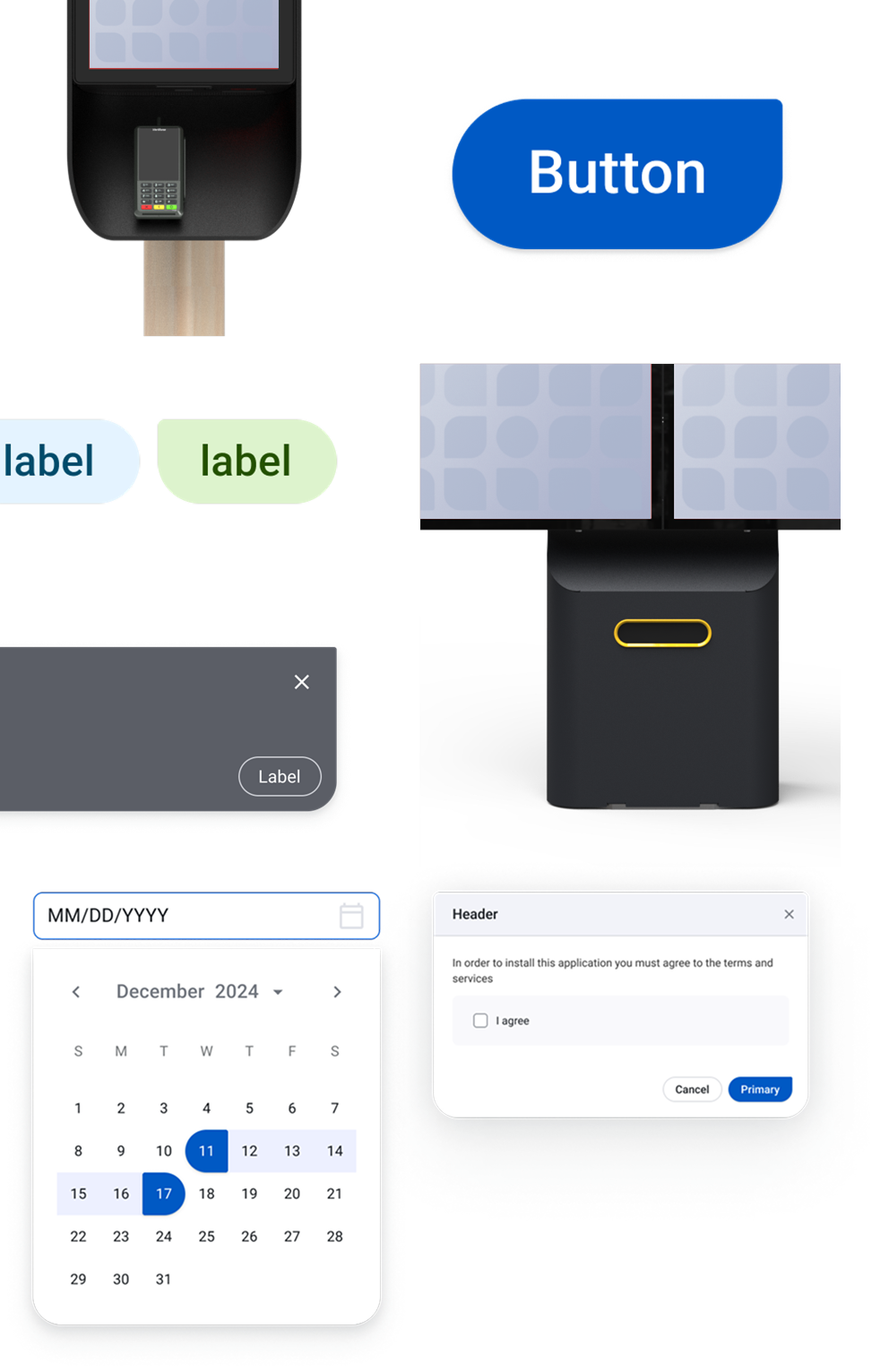
Signature teardrop shape with asymmetrical corner radius
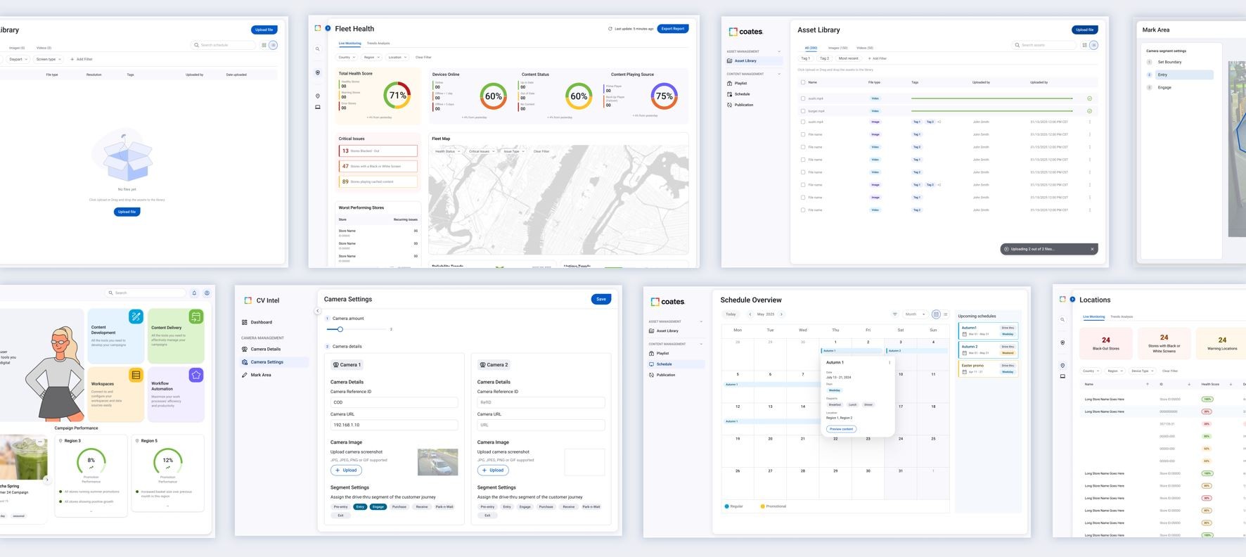
CDL 2.0 now backs four new products in design and development, including the shipped Intelligence Center. Craft details like the signature teardrop shape and asymmetrical corner radius tie the digital system straight back to the hardware form.
CDL 2.0 ACROSS NEW PRODUCTS
REFLECTION
Building a stronger case for building the code repository
The hardest part of a design system isn't designing it, it's getting non-designers to use it. The design team was very much in alignment, but getting financial and development investment to bring the design system to life took longer than expected.